By Sarah Peake
It can be tempting to think of interiors as being all about the surface. Yet, as much as a room might look beautiful in a photograph, it is also important to consider how it makes you feel when you’re in it. For me, the ultimate aim of design is depth and authenticity.
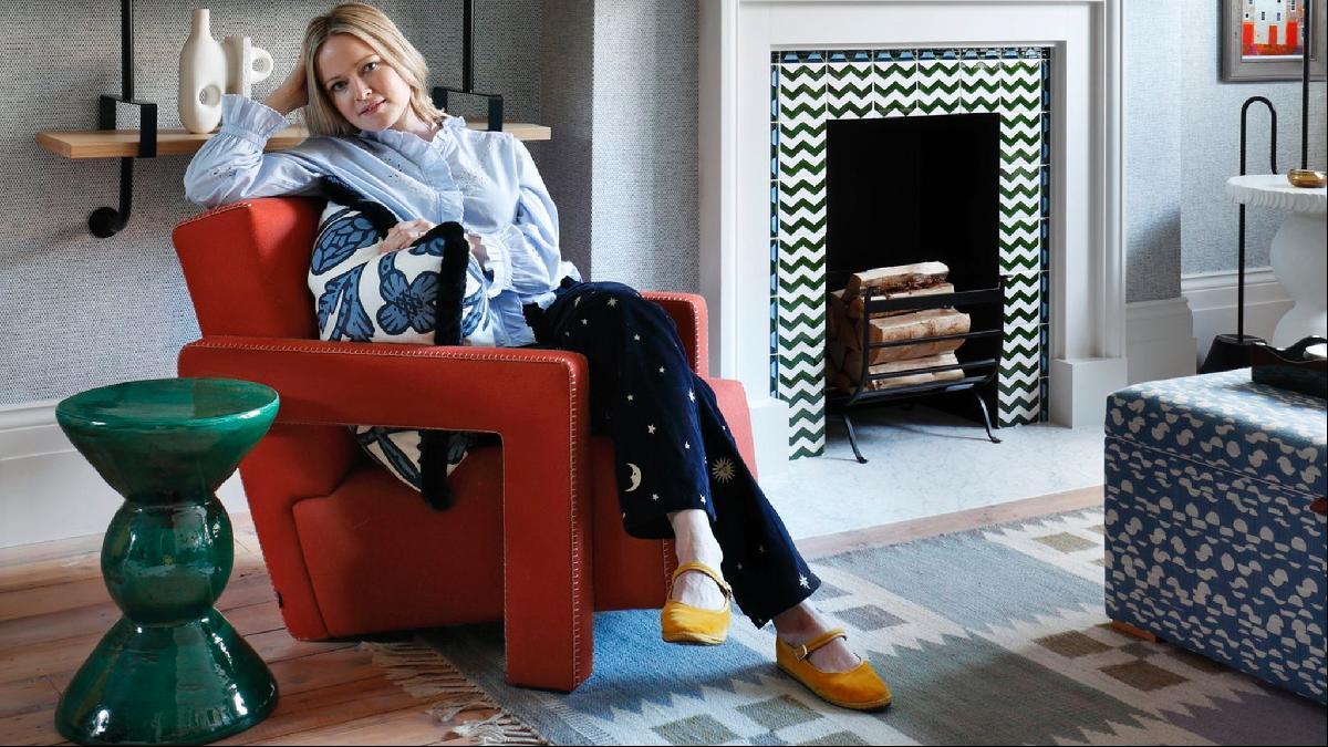
The key to depth is contrast — a tension between form and colour, texture and pattern, old and new. Every room tells a story and contrast is the driving force behind the plot. As you walk further into the room, your eye is drawn by little details: a fringe on a cushion, a modern desk lamp on an old barrister’s desk. The best rooms entreat our eyes to zoom in and out, flitting between a major theme and minor detail, and it’s often in these details that we can tell the best stories.
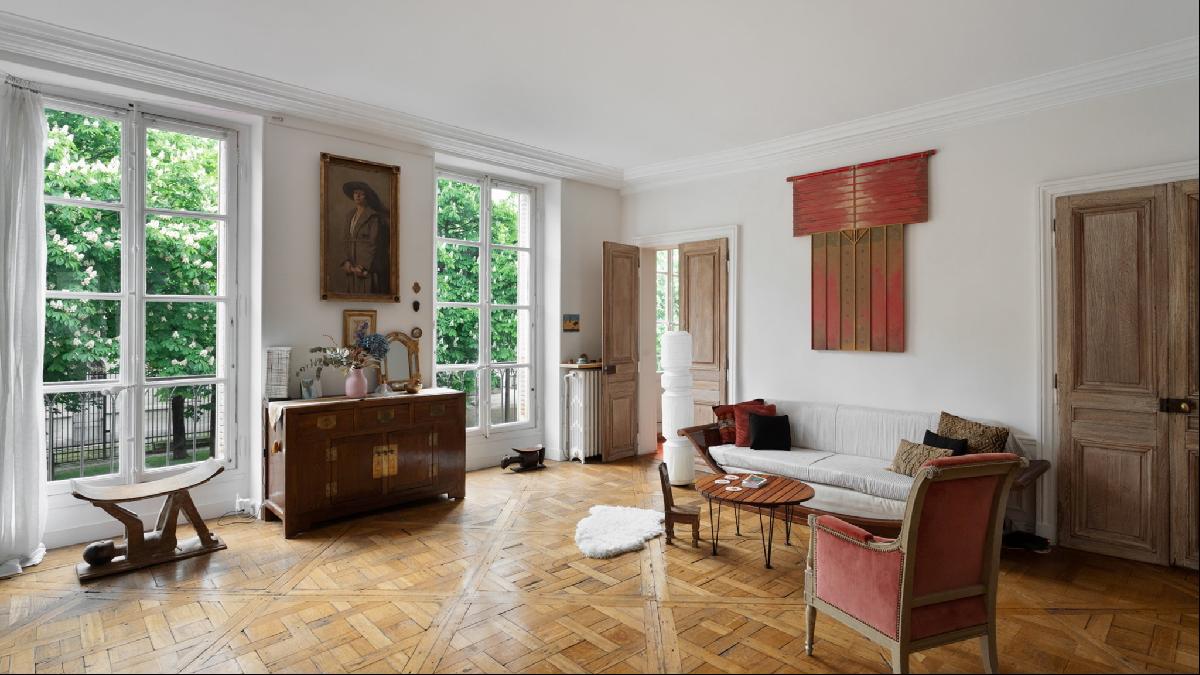
Here, I share my tips on how to do just that, using this delightful four-bedroom apartment in a 19th-century building near the Jardins du Luxembourg, in Paris, which is on the market for €4.5mn. With its high ceilings and traditional features, it is the perfect blank canvas.
Introduce a modern twist
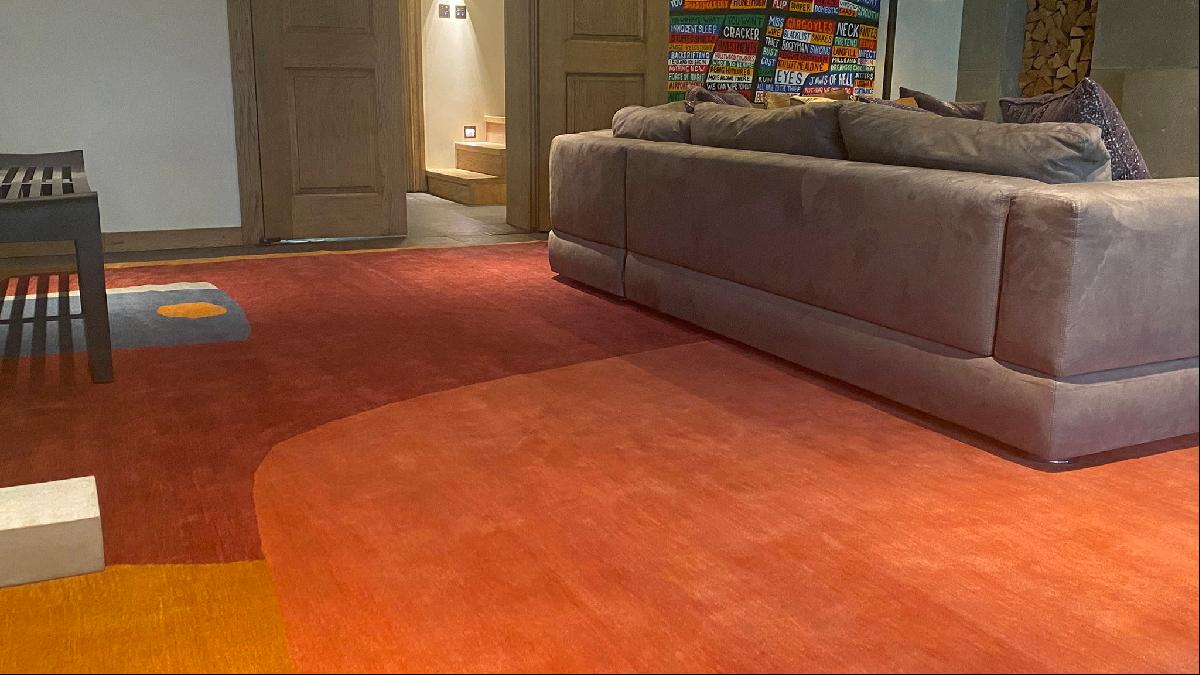
I often begin with rugs — they are a unifying force within a space and act as a perfect anchor around which to build the rest of a scheme. Gideon Hatch’s rugs are large and abstract with a thick pile and beautiful colour. This Boulder rug would be the perfect contrast to the Versailles parquet floor and traditional architecture.
Seek out the little details
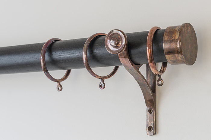
Details are the essence of design. With curtains, decisions on details can make all the difference — it’s not just about the fabric. What you do with headings, poles, length and linings matters.
For this room, I’d choose a simple, light-coloured linen or wool fabric. For beautiful natural materials look to Rogers and Goffigon or Rose Uniacke. A euro-heading — where the pleats are pinched at the top, but open on the bottom — would keep the style simple and unfussy to avoid competing with the architecture. Finally, I would use this beautiful metal and ebonised wood curtain pole from Tilly’s Interiors as a nice contrast to the light and yielding curtain material.
Embrace the handmade
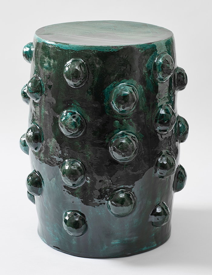
Handmade — or even homemade — objects are great for adding depth and a narrative to a space. There is always a story behind them and it is wonderful to see the artist’s hand at work. They often have a messy eloquence: the little imperfections are an essential part of their beauty. It might be a vase you picked up on holiday or a milk jug lovingly crafted by a family member.
I love these tactile earthenware side tables by Caitriona Manoury, which are twice-fired to achieve a beautiful textured glaze. You just want to reach out and touch them!
Have fun with contrasting fabrics
Contrast is key, not only across the scheme but also in the details. When you sit down on the sofa you notice all the different fabrics on the upholstery seat, the back cushions, the braid or the piping. The interplay between these is what creates an authentic, comfortable sofa.
I love to use beautiful embroideries and Vanderhurd makes some of the best. Wakame Shadows — one of its newest designs — has an irreverent, playful quality and would look wonderful as a cushion on a plain-hued sofa.

Expect the unexpected
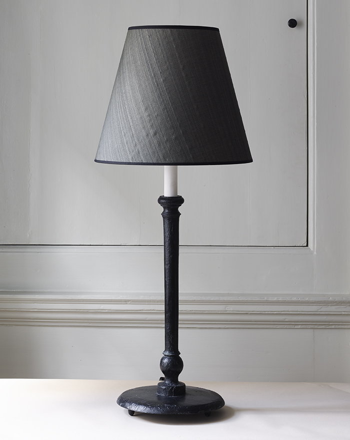
In most rooms I design, I will have something that’s slightly at odds with everything else — an element that jars with, but does not disrupt, the harmony of the space. Something oversized often works well, such as this bronze lamp from Marianne Kennedy. It is almost 1m high and would look brilliant on a table that it is slightly too big for. It also has a wonderful horsehair lampshade, which adds texture and draws the eye.
Photography: Alexander James; Isabela-Mayer/Knight Frank


