By Edwin Heathcote
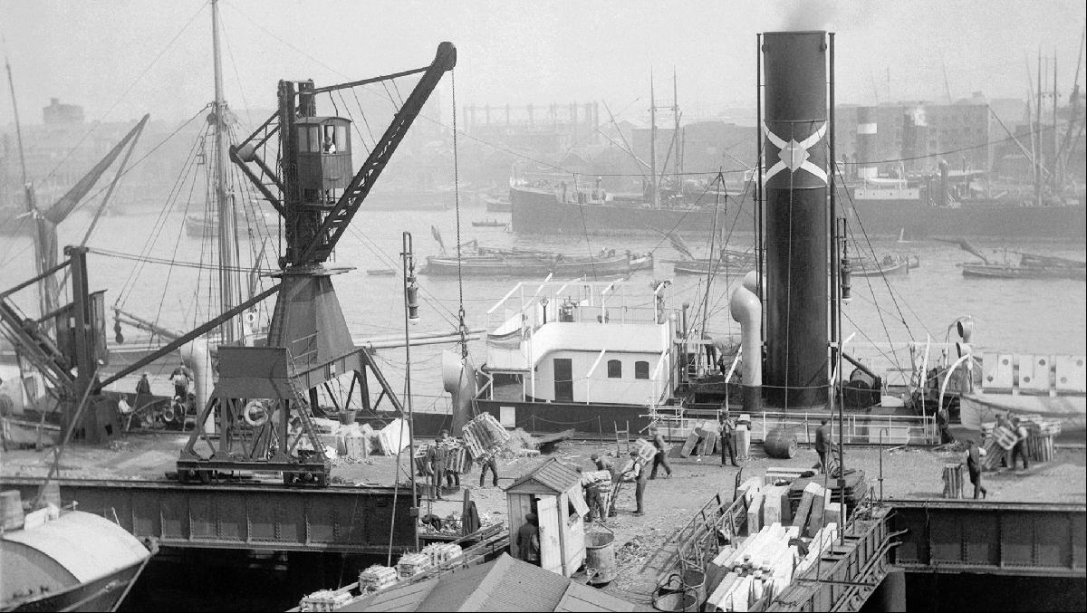
When London Docklands began to come slowly to life again in the early 1980s it was the huge Victorian brick warehouses that were reinhabited first. These remarkable riverside buildings in Wapping and, later Butler’s Wharf, had become architectural dinosaurs; massive infrastructure built for docks that had moved downriver, for bales and crates of cotton, spices and fruit brought in on boats that would now look like dinghies compared with today’s huge container ships.
The buildings seemed like a relic from a long-lost, romantic past and some of that romance seemed to seep from their bricks and beams, tying them to an impossibly different city in which these were the busiest ports in the world.
Now, walking around a bleak, almost empty Canary Wharf on a rainy day in what not so long ago would have been rush hour, I could not help thinking whether the same might happen to the area’s office blocks.
Canary Wharf has had an incredible ride. In the 1980s the docks were opened up to business, sprouting office towers to create a new London business district. The built manifestation of deregulation and the Americanisation of architecture, Canary Wharf emerged as a result of a new kind of enterprise zone where the local authority gave control over to the developer and which allowed a greater degree of architectural freedom.
The developer — originally Toronto-based Olympia & York and then, since 2012, the Canary Wharf Group — has been an exemplar of private sector panache. Its success even forced the City to undergo its own high-rise revolution.
As a place Canary Wharf simultaneously exhibits everything that is bad and much that is good about the privatised model. Walk over the road to Poplar though and you perceive it for what it is: a private gated island with its own security and its own rules. It is a peninsula of privilege divorced from its tatty, traffic-choked surroundings but also separated from real life. There are no schools here, no community centres or clinics. This is business.
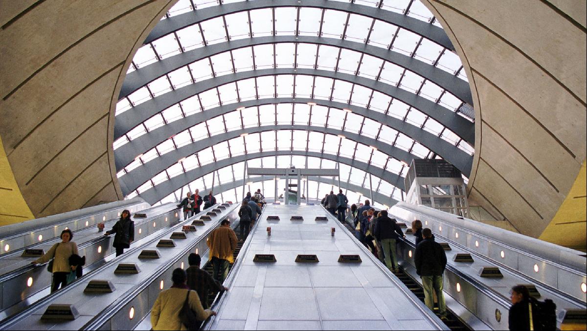
The glassy office stumps and shiny smooth corporate behemoths now sit mostly empty. Are they the spice warehouses of today? Will we ever look with longing at the reflective towers and stainless steel spandrels and bathe in nostalgia for the commute, the lifts, the marble-lined, double height, contemporary-art-adorned lobbies and corporate coffee chains?
More pertinently, will we yearn to live in them? To find ways of inhabiting this now-endangered archetype, the tall office tower, which once looked like the future and now looks suspiciously like the past?
It was the question that struck me as I wandered between the towers and beside the waterways, and noticed that the only real activity was construction. Just as the towers are emptying out, new ones are being built, most intensively at Wood Wharf, to house exactly the workers who are no longer working in the other towers.
It looks like a strange future, a piece of city wrought at great expense from the remains of the infrastructure of global trade just as the old is closing in on itself, shutting up shop. If the first generation architecture of Canary Wharf was intended to evoke a generic North American setting, somewhere between New York, Chicago and Toronto, without the constraints and conservatism of the City, the second generation, the residential towers, are a nod to a global convention of luxury living.
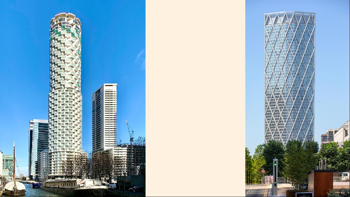
One Park Drive by Swiss architects Herzog & De Meuron is a fascinating tower, the best by far of the new buildings. Cylindrical in form, it stands out against its blockier neighbours. It shifts as it rises, changing profiles like a camshaft, and recalls the robust and distinctive towers of Chicago’s Marina City by Bertrand Goldberg (1968). The similarity cannot be an accident, but, unlike Marina City’s slightly awkward wedge shape, One Park Drive is a complex tessellation of volumes, its apartments more like airy lofts.
Beside it is 10 Park Drive, designed by Stanton Williams, looking a little like a sub-Harry Seidler tower that might look more at home in Sydney. Nearby is Horden Cherry Lee Architects’ Newfoundland Tower with its slightly disruptive diagrid façade, which looks like a solution in search of a problem. It is one of those buildings a little too keen to create an image for itself from structural acrobatics. Looking more office than residential, it illuminates a little of the problem here: the menagerie effect of North America, Asia and a globalised dockside vibe makes it look unspecific. This could be anywhere. But perhaps that is fine.
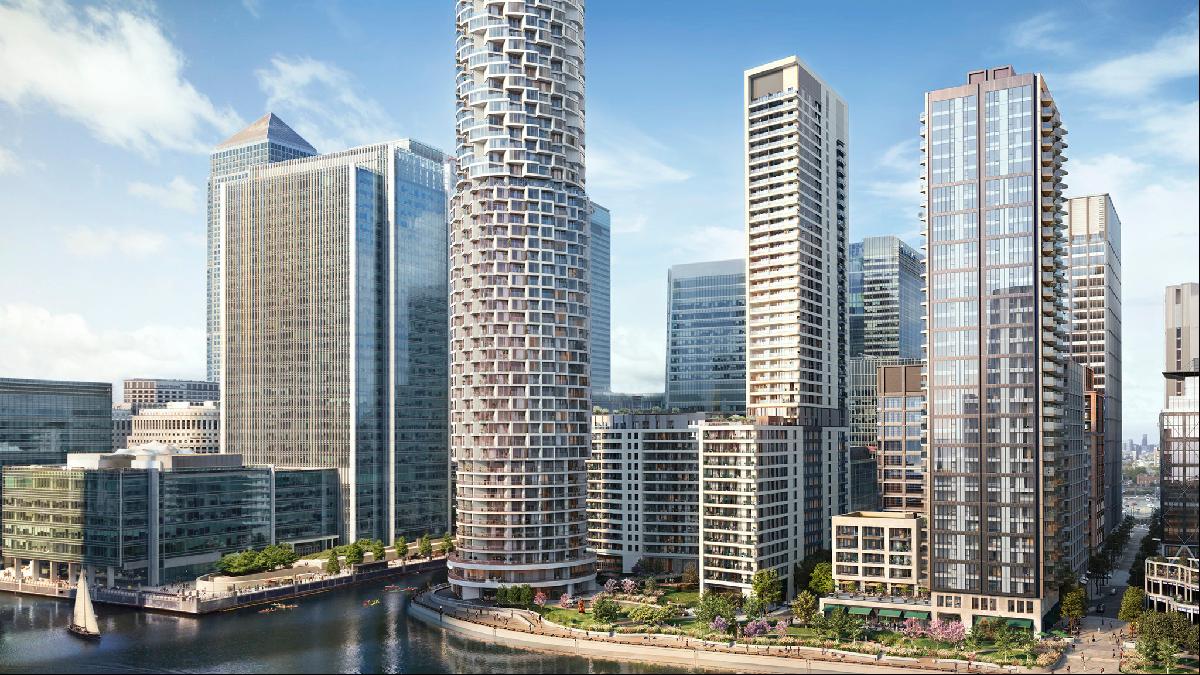
There are plenty of other towers slated — designs by Pilbrow & Partners, KPF, Grid Architects, and Allies and Morrison — but it is perhaps a little more difficult now than it was when the Canary Wharf Group bought the site to see where it might be going.
Is this really the future? Are we going to want to live near work? Or are we all already living at work? And what, then, happens to the places where we used to work? The juggling between these two phases of one of London’s most visible developments will see that future play out. Somehow.
Search for your next home in London on FT Property Listings.
Photographs: Getty Images


