By Sheena Murphy
Growing up in England, much of my time was spent in maximalist spaces. Home was a small suburban flat decked out in 1970s floral wallpaper, brown shag-pile carpet and velvet upholstery. My grandmother’s house, where I often stayed, was a melange of pink and red Victorian-inspired chintz carpeting, embossed wallpaper covered in layers of paint and brass ornaments as far as the eye could see. For a long time, that aesthetic was my happy place.
When I later studied interior design at New York’s Parsons School of Design I went in as a very Victorian-loving colour-embracing designer only to graduate and work with modernist and minimalist architects. My aesthetic had shifted quite dramatically and I craved more simplicity in design.
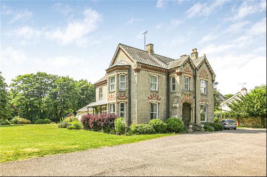
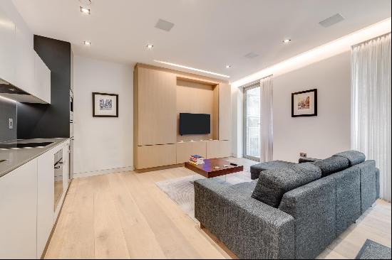
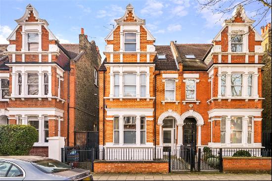
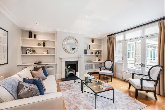
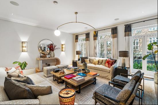
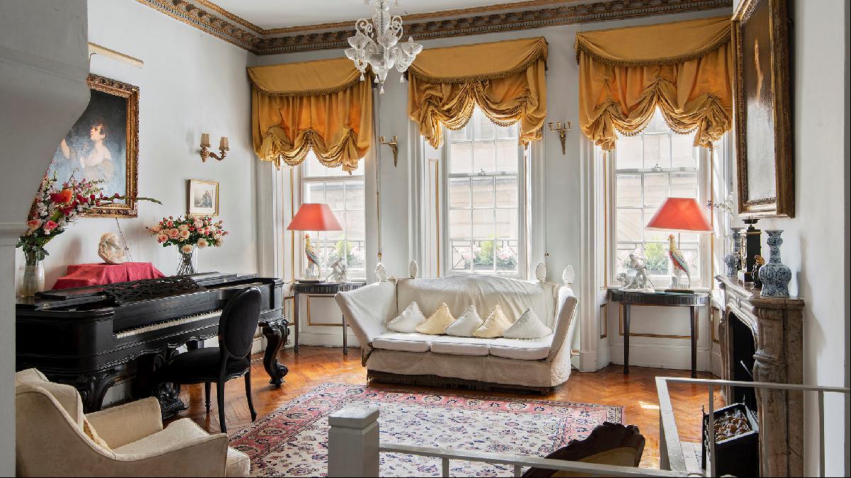
That simplicity has been evident in my work for years now including with Nune, the London and New York-based design studio I founded. Neutrals are often thought of as boring, cold and beige, but done right, they can be exciting, enveloping, cosy and incredibly versatile. Here’s my guide to designing with neutrals, using the living room of this six-bedroom Grade-II listed house in Mayfair. The property is on the market for £6.25mn.
Let there be light
When designing with a restrained palette, it’s important to pay particular attention to how lighting affects the experience of colour. I always recommend having a variety of light sources so you can shift the mood depending on how you feel or how you’re using a space.
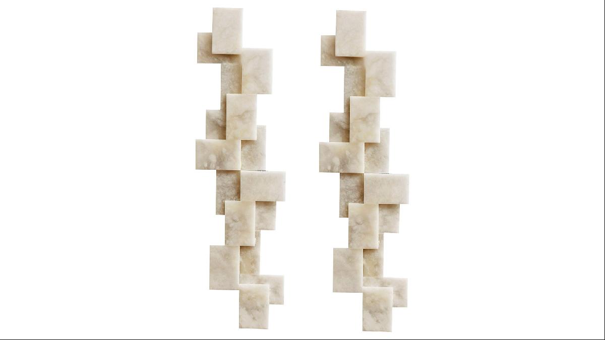
Overhead spotlights can create awkward shadows on the wall and distort paint tones. In more intimate spaces such as this living room, I would opt for a chandelier or pendants on the ceiling, wall lamps for soft, peripheral illumination, as well as floor and table lamps for more task-oriented activities. This allows maximum versatility and will help flatter neutral tones. I love these cubic alabaster wall lamps by Studio Glustin, available from 1stDibs, for the soft light they cast and their sculptural interest.
Play with shapes
At Nune, one of the wonderful things about the way we design is that it opens up lots of opportunities to play. Designing your home shouldn’t be too serious and the decorative elements are where you can really have fun and experiment. It’s common for people to be more expressive in small areas but that doesn’t have to be the only place with a bit of personality.
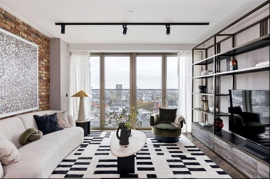
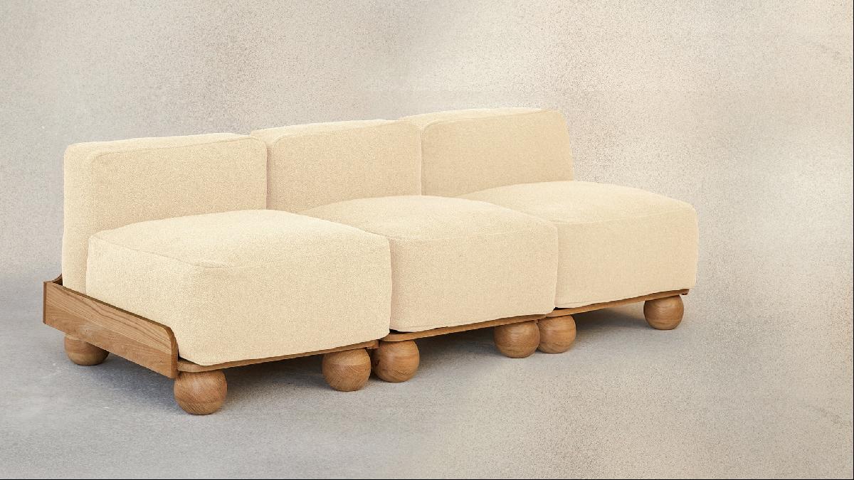
Getting the right balance of shapes, materials, tones and style is what ultimately creates a sense of dynamism and spirit in a room. I love to combine linear and geometric elements with curving, whimsical forms, as with this Fred Rigby sofa. Once you start looking, you’ll find so many ways to bring different shapes into your home. We encourage all of it!
Think holistically
Alongside sustainability, one of the biggest considerations in our designs is longevity. We achieve this by avoiding trends as much as possible and by ensuring the home is visually cohesive. With furnishings, thinking holistically means inhabitants can swap pieces from other rooms knowing that it won’t disrupt the overall harmony, reducing the need to buy more furniture.
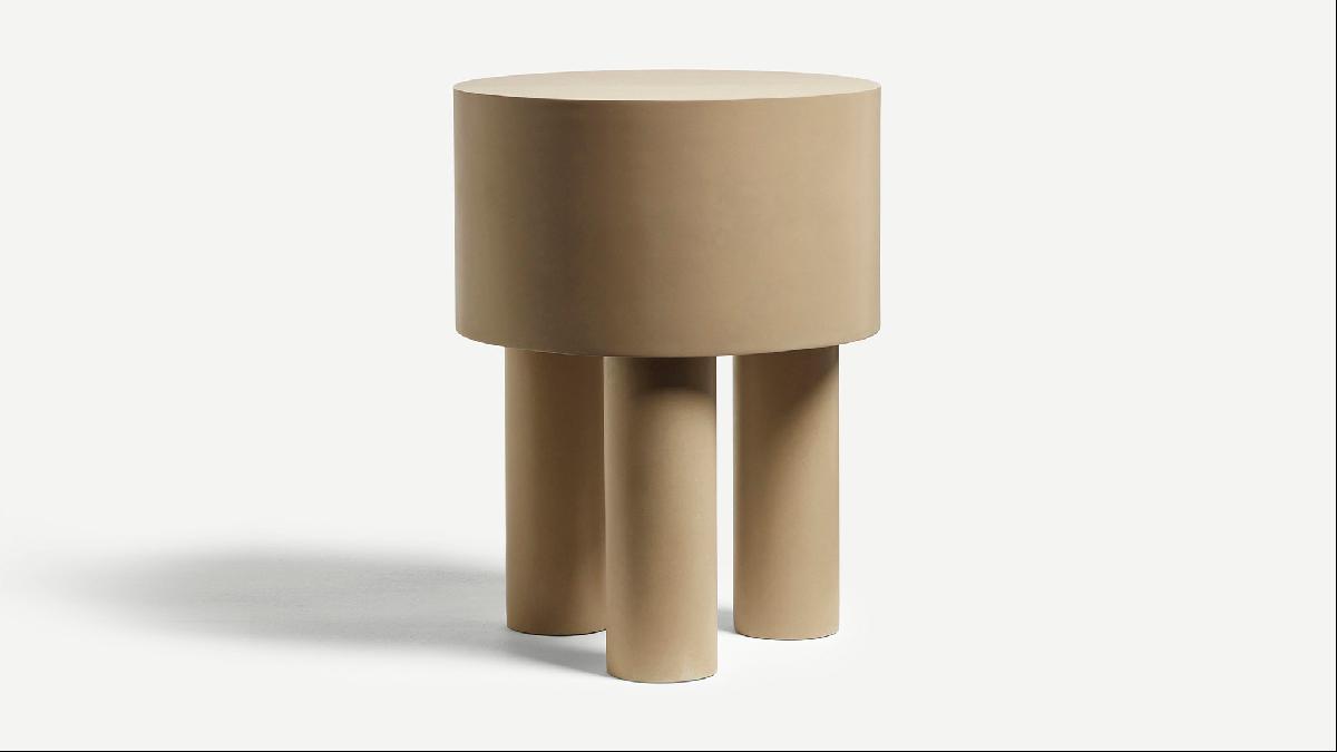
Designing with neutrals allows you to play with shape, texture, tone and styles, which is a crucial part of what makes visually quiet interiors successful. More pronounced elements have to be complemented by simple pieces that blend and balance the room. These items tend to be more easily moved around too, such as this uncomplicated but still very special side table by Malgorzata Bany, available from The New Craftsmen.
Embrace texture
In order to avoid a room feeling flat and boring when you’re minimising the use of colour, you have to go big on texture. The best neutral interiors are incredibly nuanced; almost every surface offers an opportunity to introduce texture.
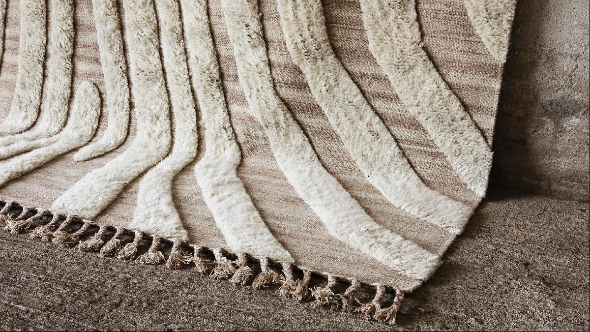
An area we often start with is the floor, which has the potential to set the tone in a space. It’s important to get the scale right and my advice would be to go bigger than you think. Unlike in this property, all the seating should be at least partly sitting on the rug, as this anchors the furniture in the room. I love this wool and cotton pile option from Danish brand Cappelendymir. It introduces an interesting graphic element and is also incredibly soft underfoot.
Dress the space
Too often, people fall at the final hurdle: the layering and accessorising that comes at the end of a project. It can be tempting to figure out these smaller elements at a later date but in most cases a home will not feel complete without them.
If you’re not planning on a full redecoration but want a refresh without breaking the bank, try switching artwork and accessories. Even just new pillows or small decorative objects can make the difference. Think texture, shape, tone and material. This stoneware vase by Annaleaclelia Tunesi ticks all the boxes for me!

Photography: Knight Frank; 1stDibs


