By Edwin Heathcote
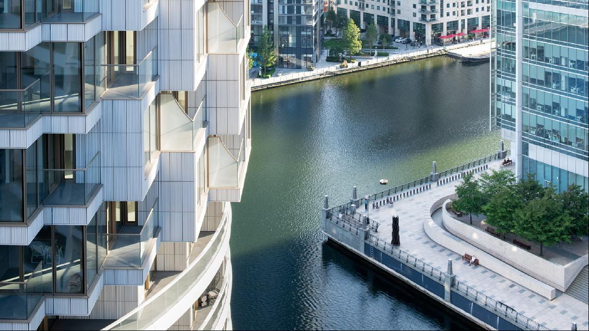
If you crane your neck to look up at Herzog & de Meuron’s One Park Drive, in Canary Wharf, it looks solid. This chunky cylinder of stone — the firm’s first UK residential tower — has been sculpted with craggy outcrops; an unusual take on that most English of archetypes, bay windows. It gives the impression that the 58-storey tower is addressing all directions simultaneously, as if it has been built for a context that is still developing.
The cylindrical form echoes many other towers, from Bertrand Goldberg’s superb Marina City in Chicago to Richard Seifert’s Threepenny Bit Building (now reconceived as No 1 Croydon) and even, perhaps, Pisa’s famously leaning landmark. Each of these buildings attempts to dematerialise the shell in its own way, playing with openings and windows, shifting floor plans and loggias.
“This was going to be the first residential tower in Canary Wharf, surrounded by offices, boxes in steel and glass,” says Wim Walschap, a partner at Herzog & de Meuron. “It needed to be different.”
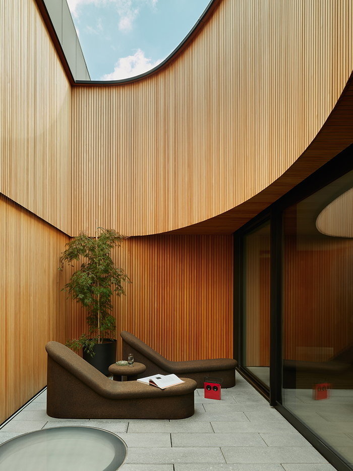
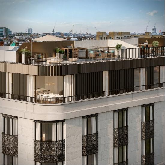
This form, however, makes for unusual plans. This is particularly true at the top of the tower, where seven duplex penthouses form a crown, with one edge of each apartment expressed as a sweeping curve. The architects suggest that it was intended as a kind of circus of houses, each with their own terraces and patios. “The articulation of the elements on the outside, the bays, balconies and the materials, introduce a more human scale and texture,” says Walschap. The apartments are not without compartmentation but there are fewer rooms than you might expect and six flats have only two bedrooms spread out through a couple of hundred square metres of space.
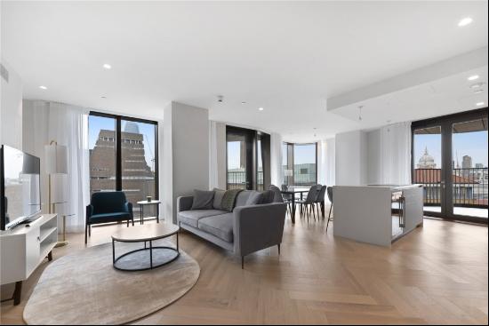
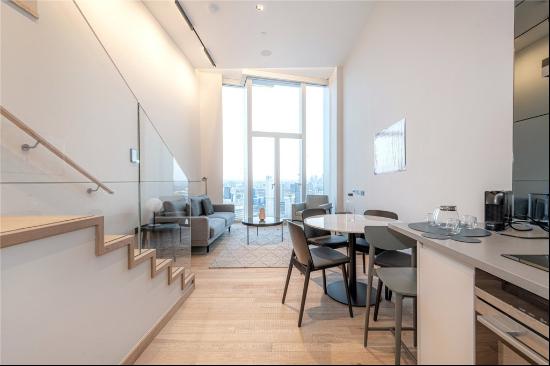
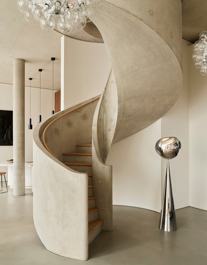
The interiors of the penthouses, which are priced between £3.95mn and £9.25mn and available through Knight Frank, feature double height ceilings of up to 4.2m, concrete columns and slick spaces framed in dark oak. Each penthouse includes a complex spiral staircase in concrete, a motif recognisable to anyone who has been to Herzog & de Meuron’s key public spaces such as the Tate Modern and Hamburg’s Elbphilharmonie.
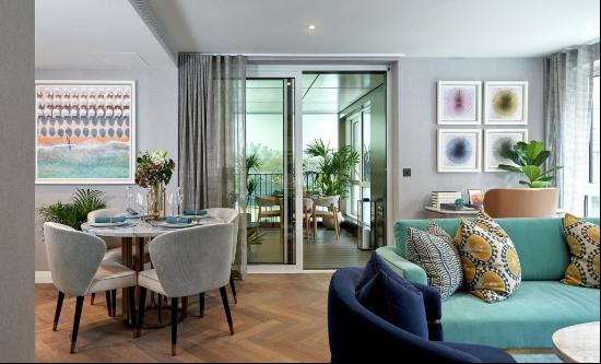
Architects rarely engage to this extent in the interiors; usually, that’s left to interior designers. Here, however, they have created a refined shell that has been populated by designer Tom Dixon. His Design Research Studio has created landscapes of things, collections of curious objects, furniture, installations, artworks and enigmatic encrustations all set against the gallery-scale walls of these 56th- and 57th-floor eyries.

The sheer weight of the concrete spiral staircases and internal courtyard gardens that open to the sky give the flats a sense of depth and solidity — you get the impression that they have been hewn from the superstructure. “With these courtyards, all of a sudden you have this moment of introversion and peace, these very private spaces,” Walschap says. They act like little sky lounges, places from which to look up at the clouds, within the solid embrace of the structure.
Another layer of solidity is imparted by the vertically striated ceramic cladding of the upper stories, which turns out to be very welcome 57 storeys up above the breezy riverside. The views, as you might expect, are astonishing, if occasionally interrupted by a glass stump that sits a little too close or something unspecific and still under construction. On the day of my visit, the rolling clouds, fast-changing skyline and toy-train effect of the Docklands Light Railway present a permanent screen of shifting light, shadow and movement, something quite spectacular if also, occasionally, not quite like the London I remember.
The bathrooms have a slick, near-future feel about them: concrete and anaemic geometric tile and white powder-coated hardware; a version of the future from the early 1970s which, until now, never seemed to quite arrive. It’s a look that’s taken into the kitchen/diners too, though here it is moderated by huge slices of dark oak, including walls that pop out to close the kitchen away.
The whole ensemble evokes a moment when Marina City and Croydon were cool, where concrete was king and urbane tubes of modernity were driven into the ground in city centres and suburbs by architects such as Gérard Grandval, Karl Schwanzer and John Portman. Situated somewhere between a castle tower, Ballardian uneasiness and hypertrophied engine parts, the tower somehow embodies a particular moment in modernism between Brutalism and delicacy, concrete and ceramic, the fort and the fragment.
Photography: Knight Frank; Robert Rieger


