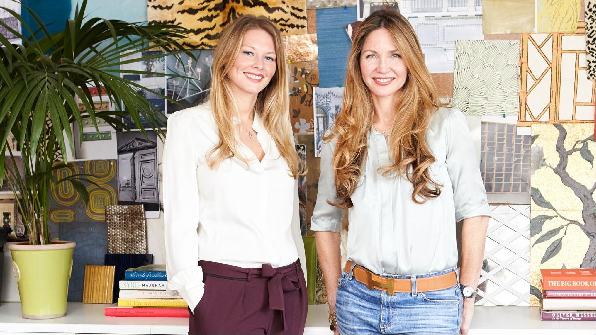
By Lucy Derbyshire and Jena Quinn
It takes effort to exercise restraint and interior design is no different. It’s easy to be seduced into using lots of colour or a particularly playful pattern, but the power of a more measured aesthetic — where form and texture are given centre stage — should never be underestimated. By shifting the focus away from pattern and colour, light, shape, scale and texture become central to the success of a space, as well as a platform for the owner’s individuality and style.
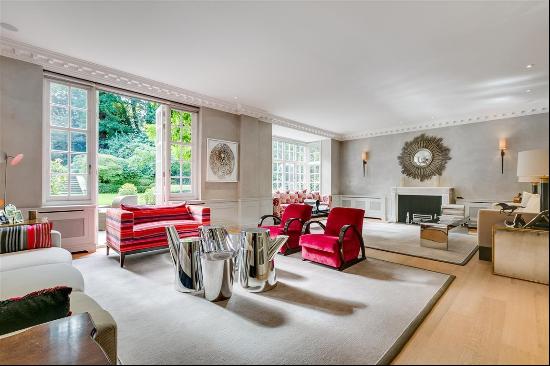
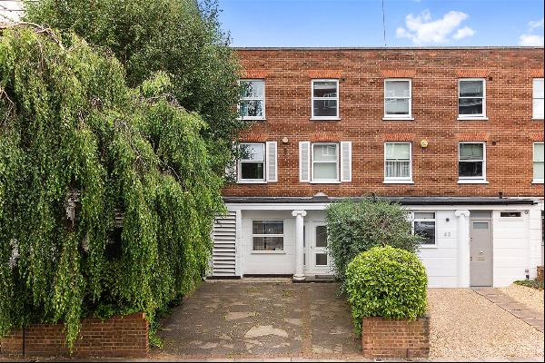
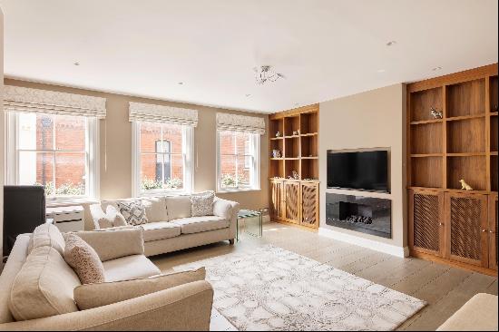
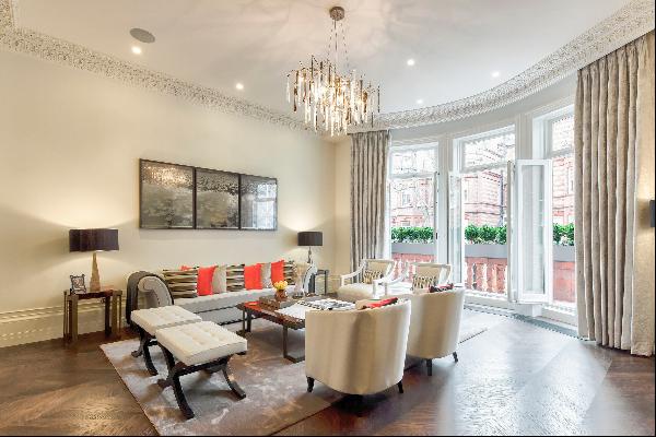
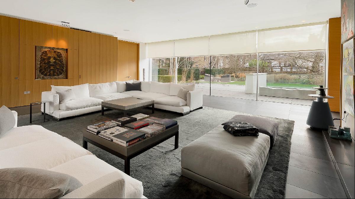
The living room of this seven-bedroom house in Kensington, on the market for £44mn, is a great example of how paring back can enhance the sense of space and harmony. Here, we offer a handful of tricks to make this interior a little more playful, inviting and, dare we say it, soulful.
Look up
For us, a pared-back interior means a space that is free from extraneous design. To allow the room to be completely immersive, every surface needs to be considered and this includes ceilings.
Ceilings are often treated as an afterthought and, as a matter of habit, often finished in white. An unexpected ceiling, done right, effortlessly draws your eye upwards, giving a sense of height and scale. This can be achieved through the use of wallpaper or paint, depending on the degree of impact desired. (A blue painted ceiling, gloss or otherwise, is a staple of ours.) If you want to take the wallpaper route, Pierre Frey and Casamance have some wonderful options, which we have used multiple times. For a grander statement, there is this stunning paper from Fromental — the perfect crown to a pared-back space.
Turn to texture
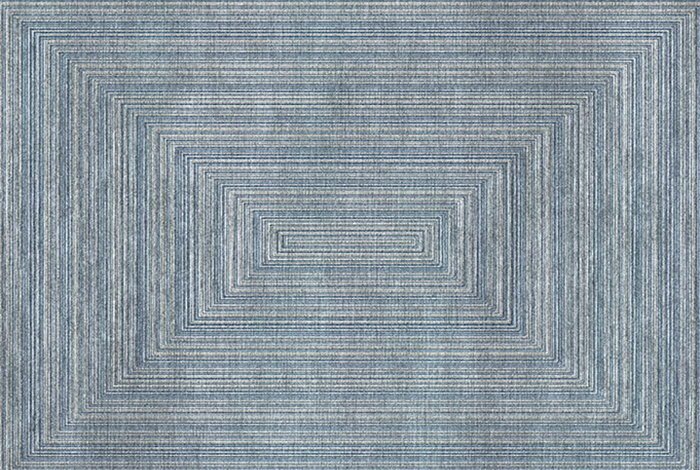
A rug is a great opportunity to juxtapose different textures and materials within your minimal scheme. Depending on preference, location and budget, you can either use natural materials such as wool and silk or synthetic fibres such as nylon, bamboo silk or PET, which is recycled plastic, meaning you can spill almost anything on to it.
When supplying carpets, we normally customise the size. Scale is important — if it’s not in harmony with the furniture and size of the space, it can lose its purpose within the aesthetic. We adore Silk Avenue’s Fugue rug. The subtle variations of colour with the varying pile height mean it will work in almost any interior.
Layer light
With the number of materials, colours and textures being reduced to a select few, it is important that they are correctly illuminated. Good lighting can be the difference between a “measured” interior being atmospheric or stark and unwelcoming.
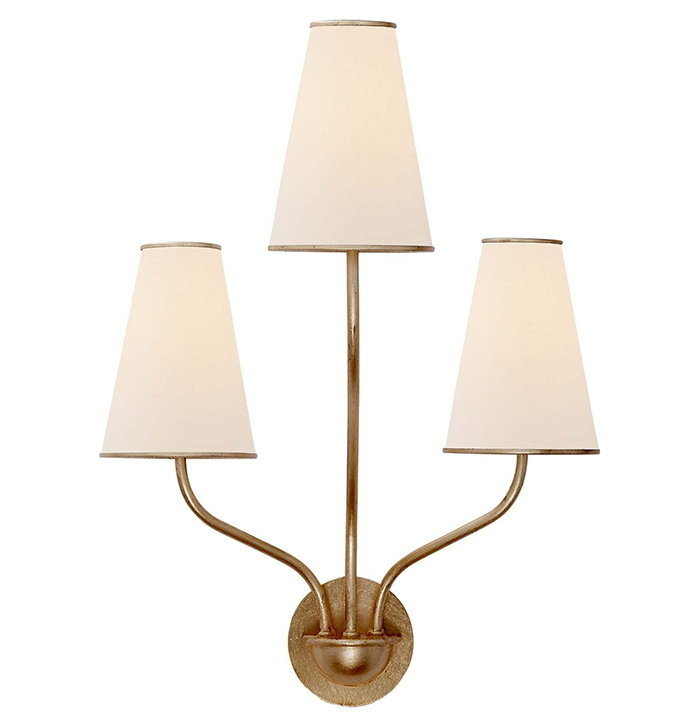
The best way to achieve this is by layering the light. Table and floor lamps create a flattering glow for guests when seated and help to enhance the visual balance. Wall lights allow another layer of light at face level when standing by creating a wash of light for the evenings and darker winter days — for example, these beautiful Gild Montreuil Wall Sconces from Lux Deco, which have a wonderful scale and design and won’t break the bank. Lastly, directional spotlights are useful to highlight important pieces, creating focused drama.
Think outside the box
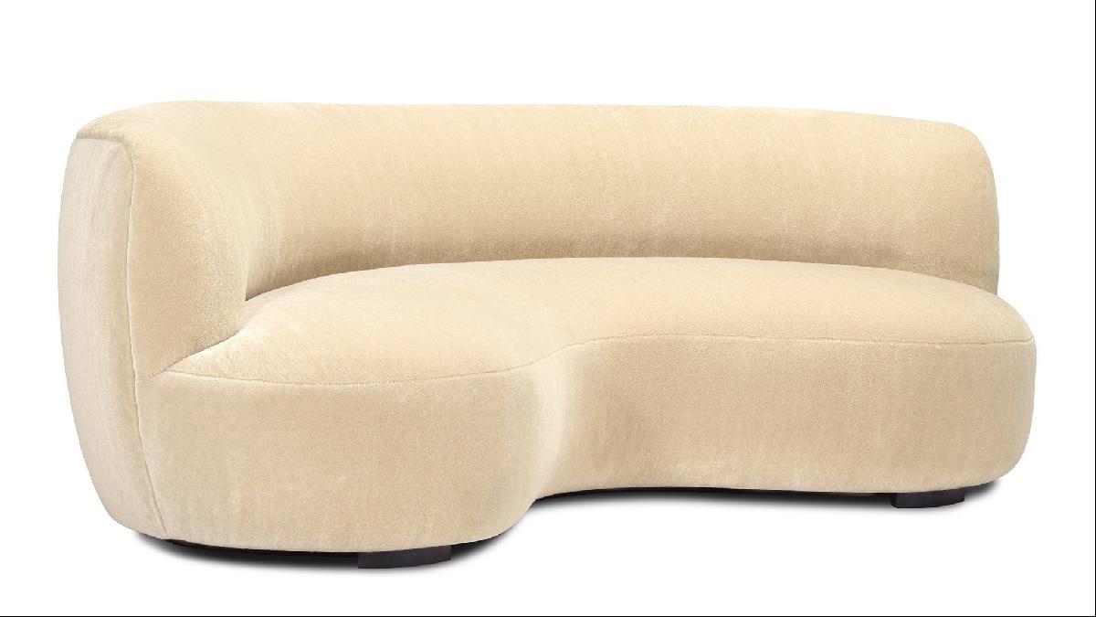
With all extraneous distractions removed, the silhouette of the furniture will have a significant effect on a space. For large rooms, where the furniture can be placed in the centre, there is the opportunity to introduce more organic and playful shapes. The living room of the Pitt Street property, for example, would be enhanced by the juxtaposition of the linear forms of the room’s architecture and the gentle curves of this sofa designed by Pierre Augustin Rose, available from the Invisible Collection.
Escalate the Art
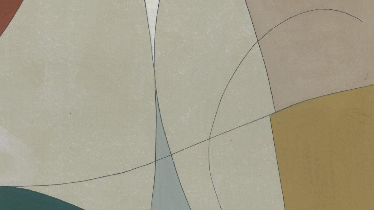
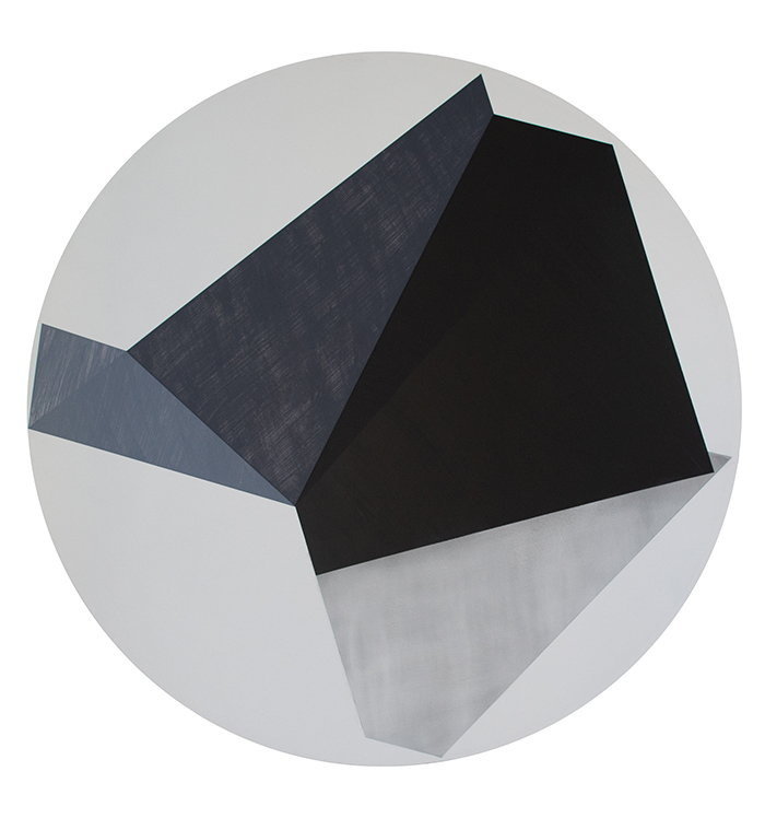
One particular advantage of a more minimal interior is the joy of an uninterrupted expanse of wall — a rare commodity! Interiors often feature bric-a-brac on shelving units or in cabinets but a restrained alternative would be to display art instead. For a modern and dramatic approach, we would hang a large-scale work instead of a series of smaller pieces. The larger scale would suggest a sense of space and create drama and focus, dictating the “personality” of the space.
We adore the work of Patrick O’Donnell, which is sold by one of our favourite art dealers, Nicholas Bowlby. This work, “Something to remember me by”, is typical of his practice, which is focused on formal elements such as shapes and tone and is the perfect subject matter for a pared-back approach.
Photography: Georgina Viney; Alex Winship Photography/Savills; Patrick O'Donnell


