By Claire Sa
Corridors are relatively new in the history of the home. Privacy was not a consideration of the 16th century, when houses were laid out as a matrix of connected rooms and people would simply flow from one room into the next with even bedrooms used as thoroughfares.
Architect John Vanburgh had to work hard to convince the Duchess of Marlborough to introduce the foreign concept of the “Corridoor” at Blenheim Palace in the early 18th century, but attitudes slowly started to change.
While they are often functional, a means of getting from one room to another, I have always thought of corridors as an opportunity; a moment of compression before opening up into a room, a space that should have its own character.
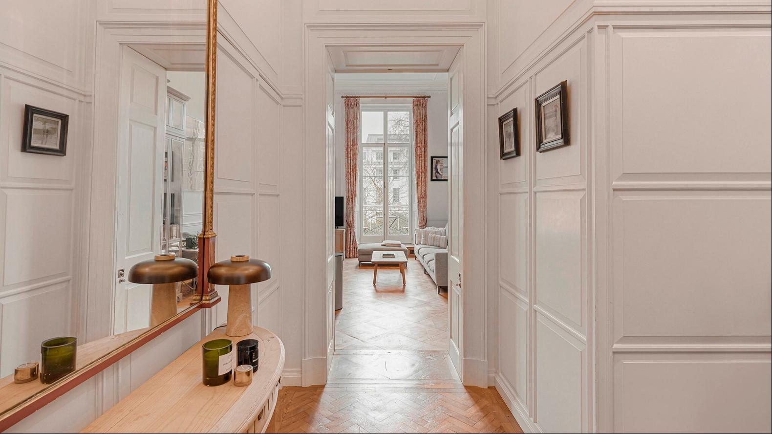
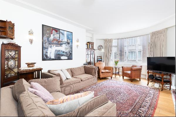
Corridors, halls and landings should be celebrated and inhabited. Here, I offer tips on bringing such spaces to life using the example of this corridor connecting the bedrooms and living room of this beautifully renovated two-bedroom flat in Marylebone, London.
Be bold
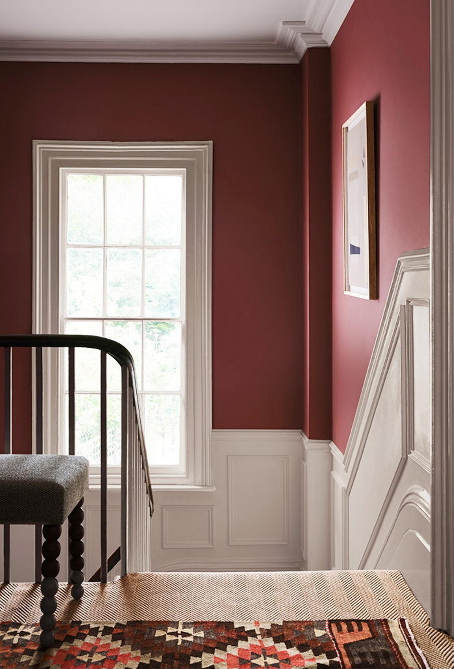
Although it is a corridor or “passing through” space, it does not mean you should shy away from colour and texture. Adding panelling to walls and a degree of intensity to wall colours make a feature of the space. Panelling is already a huge theme at the featured apartment, but the home is predominantly white. Introducing a bolder colour could add drama and, if well lit, bring glimpses of interest visible from the rooms.
We can all aspire to the mood of the South Corridor at Blenheim Palace: the grandeur of the tall stone arches over the cabochon floor; the rhythm of shadows and brighter spaces drawing your eyes over a regal runner to the next point of interest along the corridor. In the apartment, the focal point could be Paint & Paper Library’s Soumak red paint. It is bold and rich, and will light up seductively under the glow of some great lights.
Cover the floor

Adding a runner or rug to a corridor not only helps with acoustics but adds warmth. A pattern that is not too busy could work well in this apartment so as not to compete with the existing patterns in the parquet floor and wall mouldings. This 1-metre x 4.24-metre Hex runner from Luke Irwin has a hand-knotted, deep-pile, geometric design in a warm rust colour that sits easily over an oak floor and feels luxurious underfoot.
Add a mirror
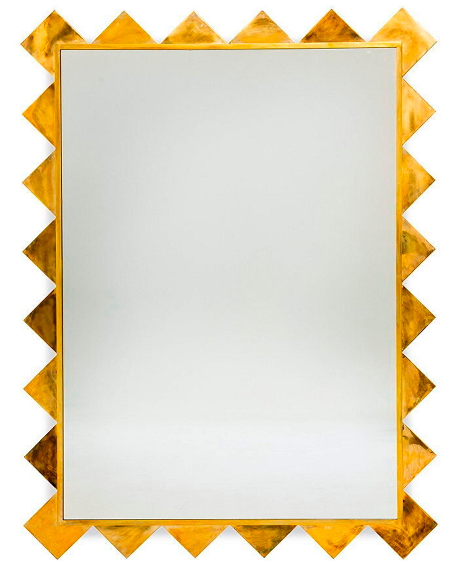
We may not all have corridors on the scale of the Palace of Versailles’ Hall of Mirrors, in which to pack courtiers to gossip and beg favours of the king, but the old trick of stretching a narrow space with a mirror really works. This powerful piece from Soane will not only add character to your corridor thanks to its shark tooth-like patterned frame, but also width by bouncing light around. The London apartment already has a mirror but sometimes having a few can create a feeling of space.
Introduce a moment to pause
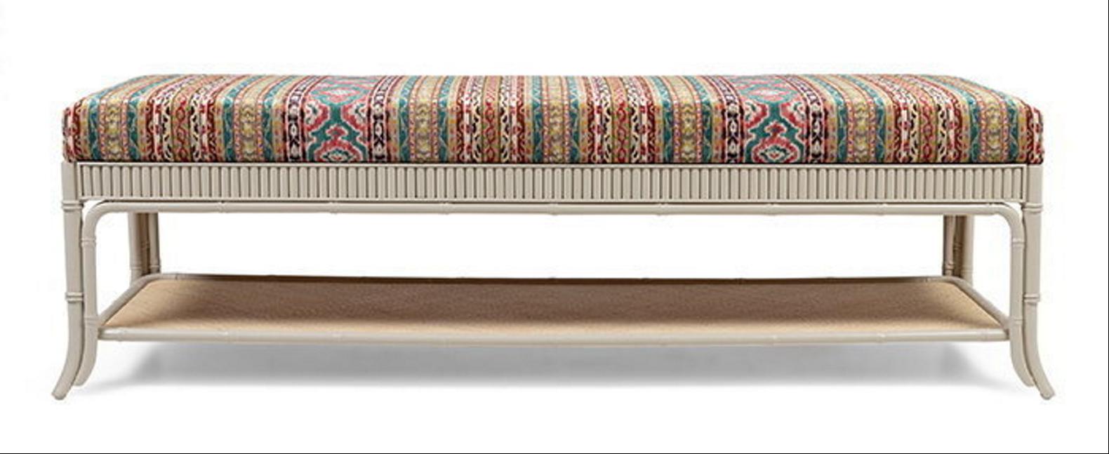
Placing seating in your corridor breaks up its length and allows you to inhabit the space. Adding a beautifully made piece of furniture at the featured flat would create a focal point. A carefully chosen narrow seat, such as this Avalon Extra Long Bench from Trove, provides somewhere to sit while putting on shoes, or to put down a bag while throwing on a coat.
Light the space
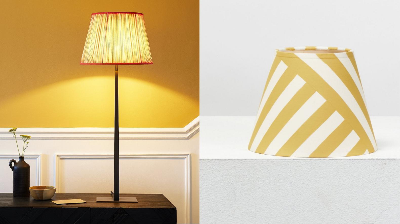
Corridors can be narrow but you can hunt down a console table that does not take up too much depth, such as this wall-mounted piece from Quindry, attributed to the French Art Deco designer René Prou. Soft lighting in an apartment is impactful because it creates shadows and highlights that are more dramatic than a flood of overly bright uniform white light, and adding a pair of lamps to a side table will always set an inviting mood. The table could be combined with these sturdy bronze lamp stands from Pooky, paired with these fun yellow striped shades by Alvaro Picardo, from gallery 8 Holland Street.
Photography: Jooney Woodward; Dimitrios Sofianopoulos/Cameradelta.com/Sotheby’s International Realty UK; Soane Britain; Paint & Paper Library


