By Thomas Jayne
I have spent much of my life living and working in old buildings. As a historian and decorator, I admire how they evoke the past and allow great comfort and often beauty.
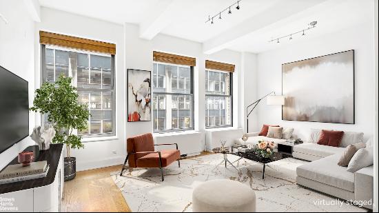
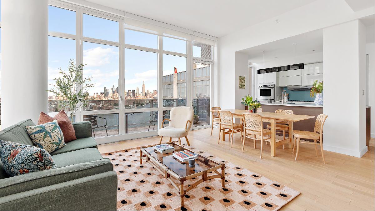
However, this modern three-bedroom apartment (pictured below) in Williamsburg, Brooklyn, has turned my head. I even think that my next place will be more like this high-rise penthouse, on the market for $3.25m and complete with an elevator and stunning view. (This is probably a reactionary stance after living almost a quarter of a century in a five-storey walk-up in a 150-year-old loft building).
I believe that traditional design can inform today’s living. In my work, I am often reminded of American novelist Edith Wharton’s remark that, “A classic is classic not because it conforms to certain structural rules, or fits certain definitions (of which its author had quite probably never heard). It is classic because of a certain eternal and irrepressible freshness.”
I like to say that we practise traditional design not because we lack imagination but because historic designs are tested and true. There are many ways to balance the old with the new. How, then, to tackle the intriguing task of marrying the traditional with the contemporary in the open-plan living space of this apartment?
Let walls add atmosphere
Rather than attempt a traditional look with historic mouldings which imitate classical rooms, I would lean into the home’s modern shell. Like most new apartments, the penthouse is painted pure white, lending the architecture an overbearing presence, which distracts from what is outside the windows: great views of the East River and Manhattan skyline.
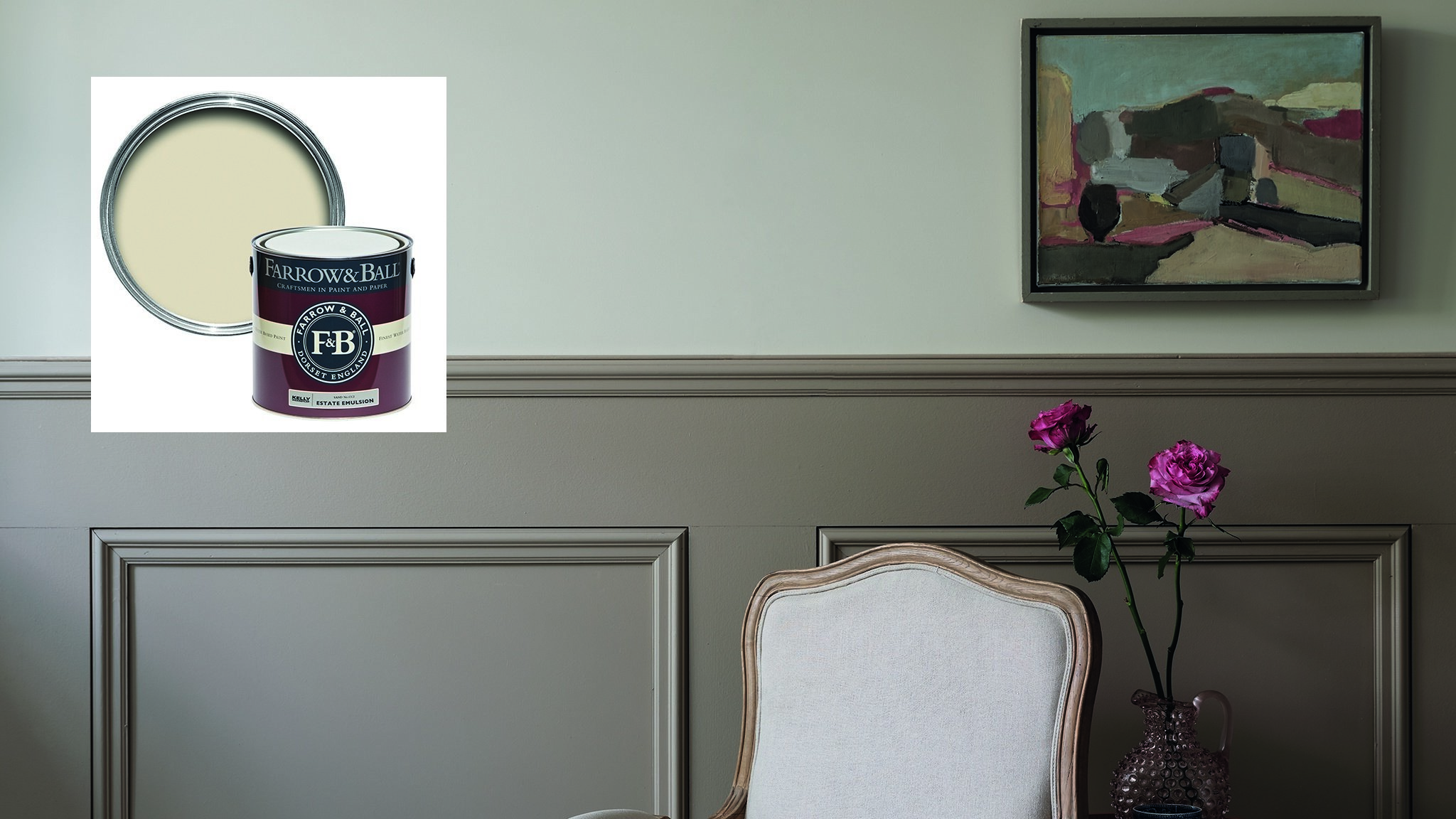
For atmosphere, I would choose from warmer, medium colours, which are characteristic of historic spaces. For those who prefer to avoid colour, picking a modestly darker neutral would frame the view and create a more comfortable feeling. Farrow & Ball’s Sand (£56 for 2.5 litres of modern emulsion) is perfect for this. Inhabitants feel more at ease, and, as an added bonus, it flatters the complexion far better than a harsh white.
Anchor and soften with rugs
In general, spaces tend to feel stark and cold without good rugs, a phenomenon that is further amplified in modern buildings such as this. Rugs help counter a room’s sharp edges and provide a visual anchor for furniture. For me, the older the better — antique versions immediately give a room a sense of tradition.
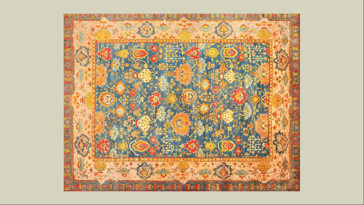
We often work with the experts at the Nazmiyal Collection, which offers a wonderful breadth of selection including this 19th-century Turkish piece ($115,000). Most Persian rugs have a single border so this one with its double border is rare. The colours have a warm palette, which works well in sun-soaked rooms.
Choose chairs for comfort
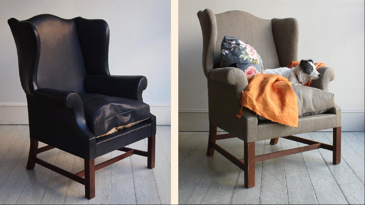
Traditional furniture creates a real sense of home, comfort and sculpture in large, open spaces. I always focus on the function and arrangement of traditionally designed chairs to allow conversation and, here, the sharing of the views. Several of these George III Camelback chairs by Howe (£6,450 excluding fabric), based on an 18th-century prototype, would be a good choice.
Add cosiness with lighting
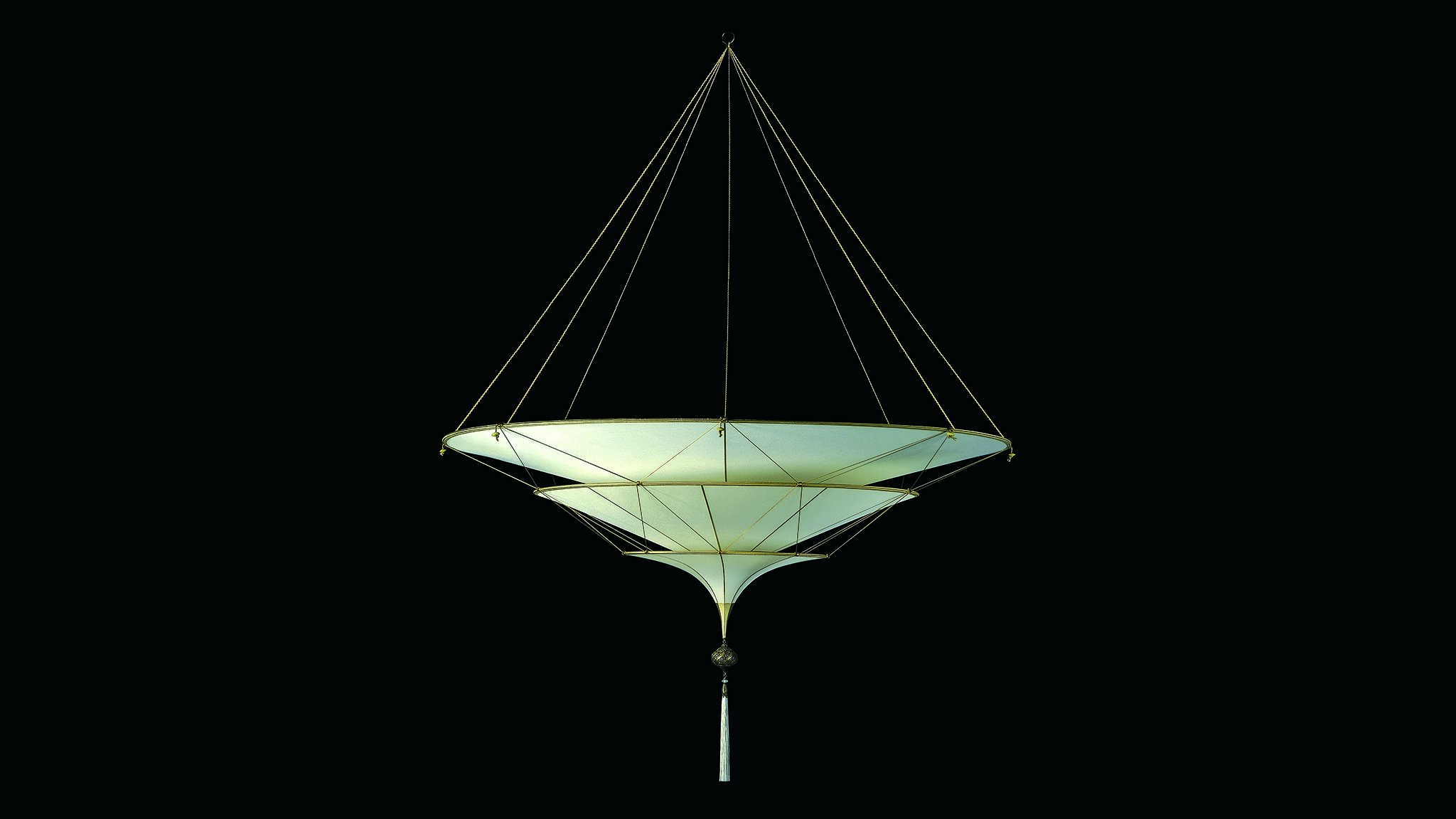
Lighting is important to every space, but you must work a little harder to create mood lighting in a large open-plan area such as this. Bringing in textural pendants or chandeliers gives rooms a sense of cosiness and enclosure. Fortuny silk pendant lights, which are updated versions of Mariano Fortuny's original early 20th-century designs that combine Venetian and Oriental influences, work particularly well in modern spaces, while retaining that old-world look. This three-tier silk version ($6,661) would be an elegant choice.
Antique shapely table and floor lamps can function as sculptures in and of themselves, and are important for mood lighting. I would also put picture lighting above select artwork to highlight the pieces.
Mix and match art
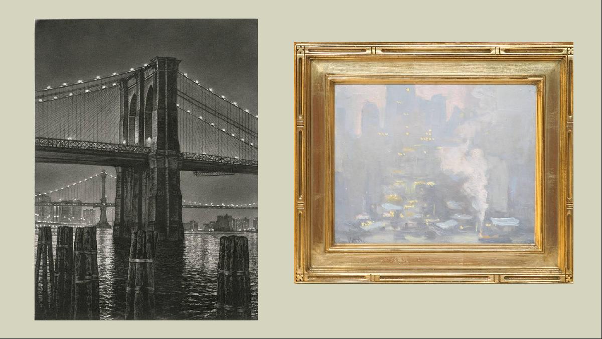
Typically, the architecture of a space does not inhibit any particular style of art. The benefit of a space such as this, with tall ceilings and minimal moulding, is that it is primed for a substantial display. There is plenty of wall to play with and, with these views, I suggest multi-era landscapes that relate to the cityscape of New York. Online marketplace 1stdibs offers a good range, such as this 1930s take on the East River (below, right) by Charles Vezin ($7,500) and Frederick Mershimer’s 2001 ‘Pylon’ (below, left) depicting Brooklyn Bridge ($4,000).
You could do a series of prints framed as panels for architectonic impact or the ever-popular salon-style hangings (known as gallery walls). Art is another area where I encourage mixing many styles to create a bridge between old and new.
The writer is the winner of this year’s Andrew Martin Interior Designer of the Year Award
Photography: Paul Costello; Mayfair International Realty


