By Jermaine Gallacher
Hallways and entrances, perhaps more than any other room, leave us open to judgment. They are, after all, the very first glimpse a visitor will get of our homes, revealing our design choices, taste and character.
Or at least that’s the idea. If I were to judge myself by my own hallway, I’d think I was an avid Agatha Christie reader (given the number of Hercule Poirot books) who doesn't look after his shoes or coats, and who is clearly very vain, going by the size of the mirror at the end of the hall. But still, I’d give it to him that he knows a thing or two about colour.
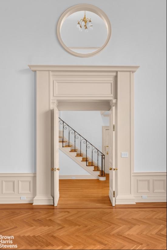
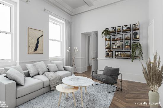
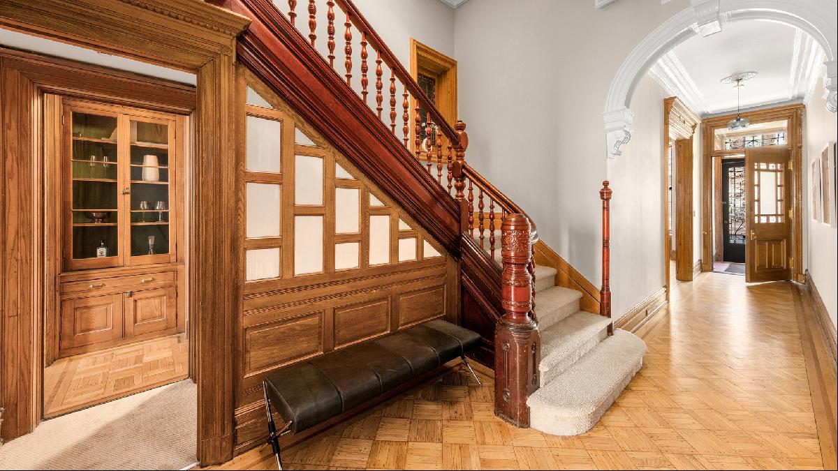
When I came across this fabulous seven-bedroom New York townhouse, on the market for $8mn, I couldn't help but pass my critical eye over the hallways and landings. In my humble opinion, they could benefit from a dash more colour and injection of character. Here are my tips for finding the right balance.
Pick a moment
All the best interiors have a dramatic focal point. Take the magnificent entrance hall and staircase at Leighton House in London, with its 17th-century azure Damascus-tiled walls — now that's what I call a moment!
A tiled staircase is clearly not right for this classic NYC stairwell but a striking moment of colour most certainly is. Here, I would take advantage of the statement staircase and introduce a bold colour on to the woodwork.
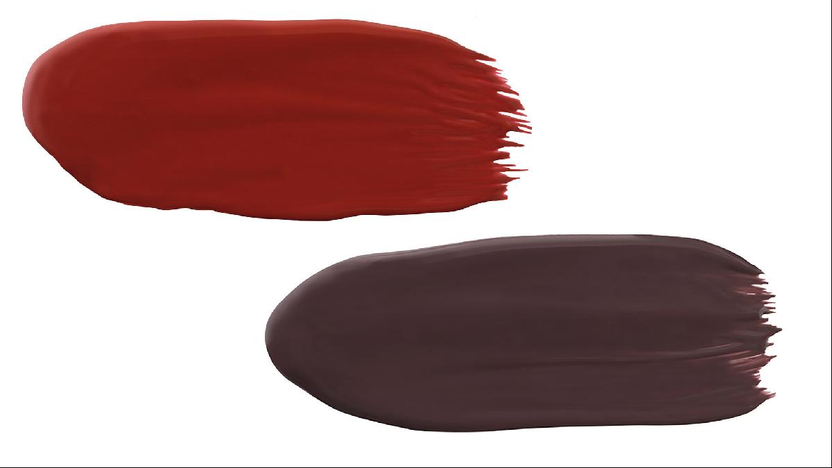
Graphenstone has a wonderful selection of 100 per cent natural paints available in practically any colour you can imagine. In this instance, I'd go for dark, high-drama tones such as Juniper or Carnelian to contrast with the white, and using an eggshell finish will reflect light as well as being more durable.
Roll out the carpet
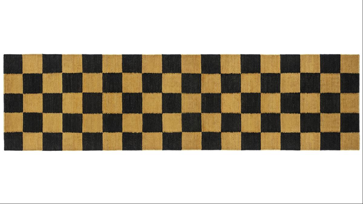
I simply adore a stair and hall runner. There is nothing more welcoming than having carpet underfoot and it’s a great opportunity to introduce some colour and character to your hallway. I think Christine Van Der Hurd’s latest collection of checkerboard rugs and runners for 8 Holland Street are the tonic for almost every room. I see the noir and ochre hand woven hemp Dhurrie runner sitting fabulously well on this landing. The sharp lines of the graphic checkerboard design will offset the grand staircase.
Keep it jolly
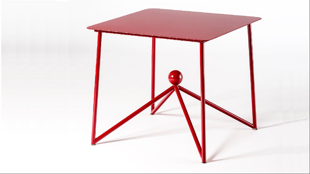
What would life be without fun and colour? I dread to think — both are so important in my life and work. I often fear we are in danger of taking ourselves far too seriously, especially when it comes to decorating. Good design can be practical, powerful and jolly all at the same time. Dalila Formentini's tables are living proof of this and are available in a plethora of colours. In my opinion, they are simply perfection and make a joyous addition to any entrance hallway.
Screen off areas
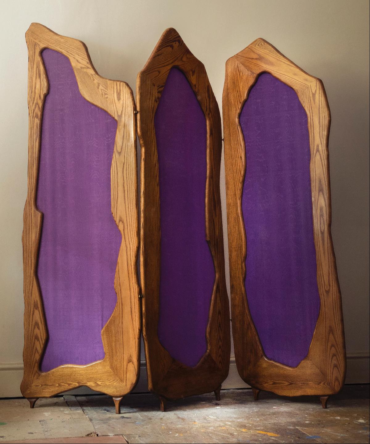
I think screens are ingenious inventions, both practically and visually. I must confess to having had my eye on this particular screen at Adam Bray's shop on Murray Street in Camden. I love the irregular jaunty shape but of course, more importantly, the fantastic colour — Pope’s purple.
An entrance hall might seem like an unorthodox place for a purple silk screen, but actually I think in this instance it will add instant character, colour and drama. And it’s great to hide unsightly things behind.
Consider seating
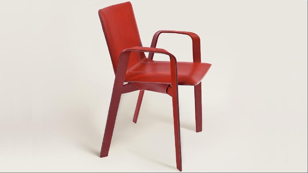
I think hallway chairs are super chic. If you're lucky enough to have the space to accommodate one then you'd be mad not to. These exquisite steel Sellier chairs by Hermès covered in taurillon leather are just the ticket. The colours range from forest green to this fabulous traffic light red. Keeping to the same palette but using contrasting materials is a clever way to play with colour, form and texture — I think one of these either side of Dalila’s red console would look totally tops!
Photography: Oliver Grove; Tim Waltman for Sotheby’s International Realty; Luca Casonato, 2018; Oskar Proktor


