By Susan Deliss
Traditionally, a library would have been where the owner of the house could retire to pursue intellectual pursuits. I once visited friends who owned a library where first editions were mixed with priceless manuscripts and furniture that had been collected centuries ago on European “Grand Tours”. In these more informal times, it’s lovely to think that there could be a room in the house where one can read without being disturbed by mobile phones and other technology. But a library should be cosy, with sofas that you can fall asleep on after reading the Sunday papers.
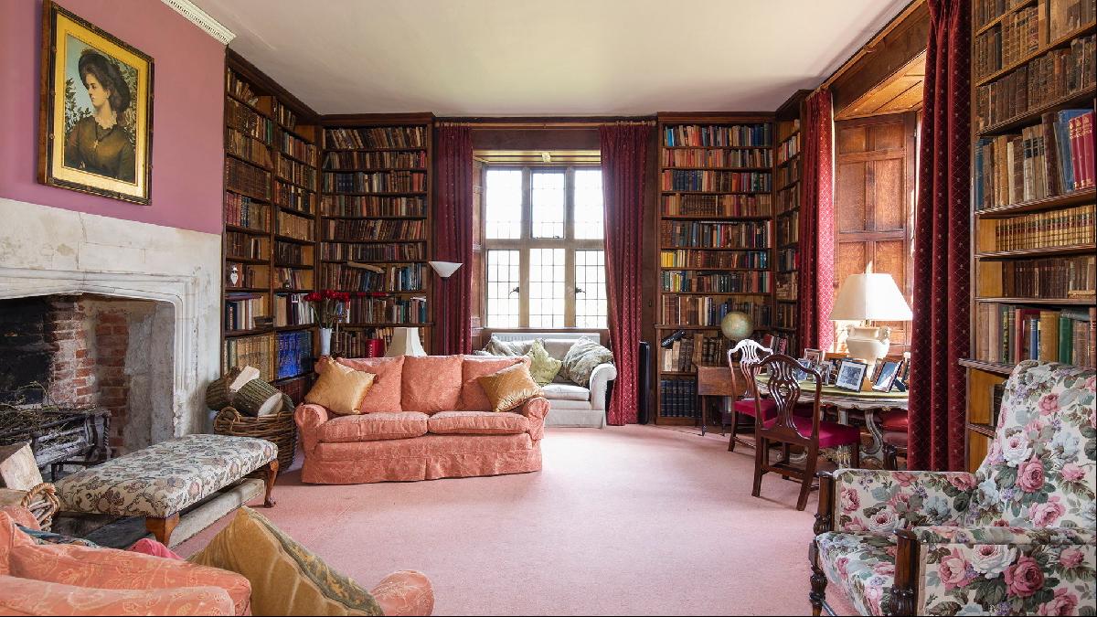
The library in this seven-bedroom house in Wiltshire — on the market for £9mn — has many lovely features. There are wooden shelves with antiquarian books, antique mullioned windows to spare the books from sunlight and a large fireplace. But it seems to have unwittingly morphed from a library into a sitting room. The seating is inexplicably arranged around the walls and there has been no attempt to create any cohesion. The room should feel calm and removed from the hubbub of the rest of the house, pervading a sense of comfort. Above all, it should feel relevant to contemporary living without breaking with its past.
Install a fender
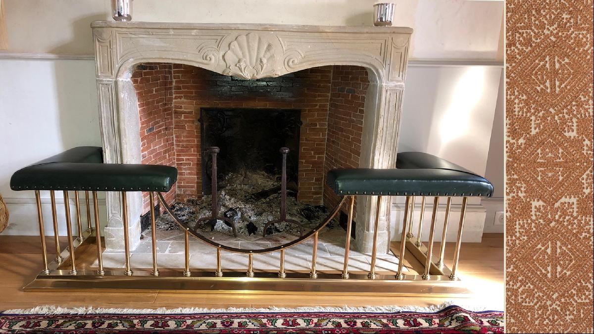
Along with the bookshelves, which should stay as they are, the fireplace is the room’s dominant feature. The downside is that it is very plain and blocked by the ottoman. Even though the fire is not the only heat source for the room it seems unfair for those closest to it to hog all the warmth. I would install this fender from Acres Farm, upholstered in this patterned tonal Fez Weave in Cognac (on the right in the picture below) from Guy Goodfellow. The fender’s curved dip would help soften the lines of the room and while it’s always tempting to use something attention-seeking on a fender, that would conflict with my objective of keeping this room calm.
Consider alternatives to paint
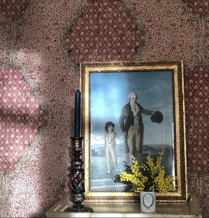
Painting the walls another colour would not add much interest or character to this room and there is the large, cold expanse of the rather plain fireplace to tone down. I would soften the whole room and dampen any noise by applying paper-backed fabric to the walls. This adds a layer of understated cosiness and texture. For this, I would use Carolina Irving’s beautiful Indian Medallion in Desert Rose.
For the woodwork and the ceiling, I would use warm, traditional tones. Presently there is what looks like a bright trade-white cornice above the fireplace. I would avoid such a pronounced contrast between the different surfaces and use Farrow and Ball Wimborne White in Estate Eggshell on the woodwork and the same colour in Estate Emulsion on the cornice. The ceiling I would paint in Farrow and Ball Pointing in Estate Emulsion.
Experiment with the curtains
The current curtains are a rather ubiquitous country house red; they add formality but no charm or cosiness. I would use a subtle pattern-on-pattern approach to layer with the walls, such as Carolina Irving’s understatedly elegant Patmos Stripe in Pompeii. This design references Ottoman-era Greece and so introduces a subtle historic aspect to the room.

Change the scale
The room is quite cluttered, which is perhaps inevitable after someone has lived there for a long time. I would use fewer pieces of furniture but make them larger and in proportion to the scale of the room. A three-seater Hambledon sofa covered in Carolina Irving’s Amazon in Earth (fabric swatch on the right, below) would be most inviting.

Weave it all together
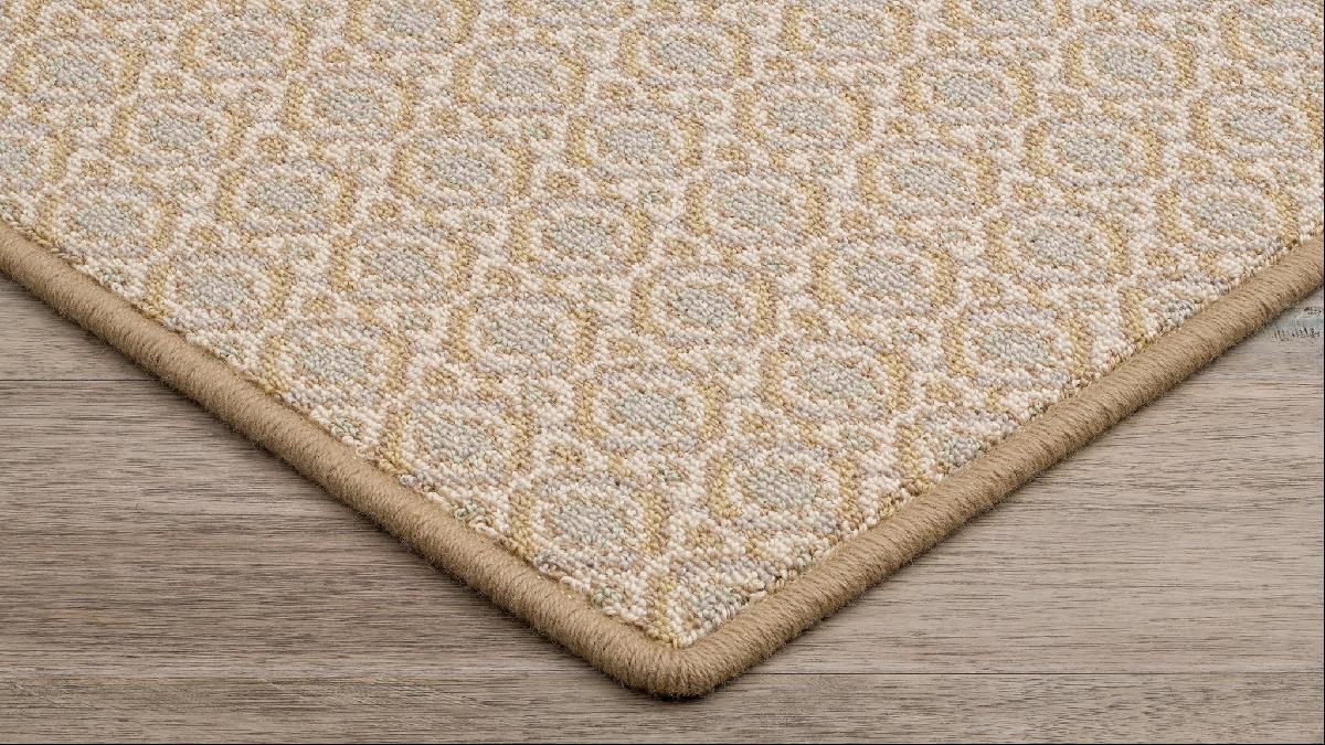
I almost always use rugs or kilims but here I would go for a very understated pattern on the carpet — though in a design that’s not a conventional country house look. Stark’s very versatile Arva carpet in Whisper would work well to underpin all the patterns in the room. Kilims and rugs are readily available in shops and auctions, so can be added later if one that is the right size and colour comes up.
Photography: Gemma Lee; Strutt & Parker


