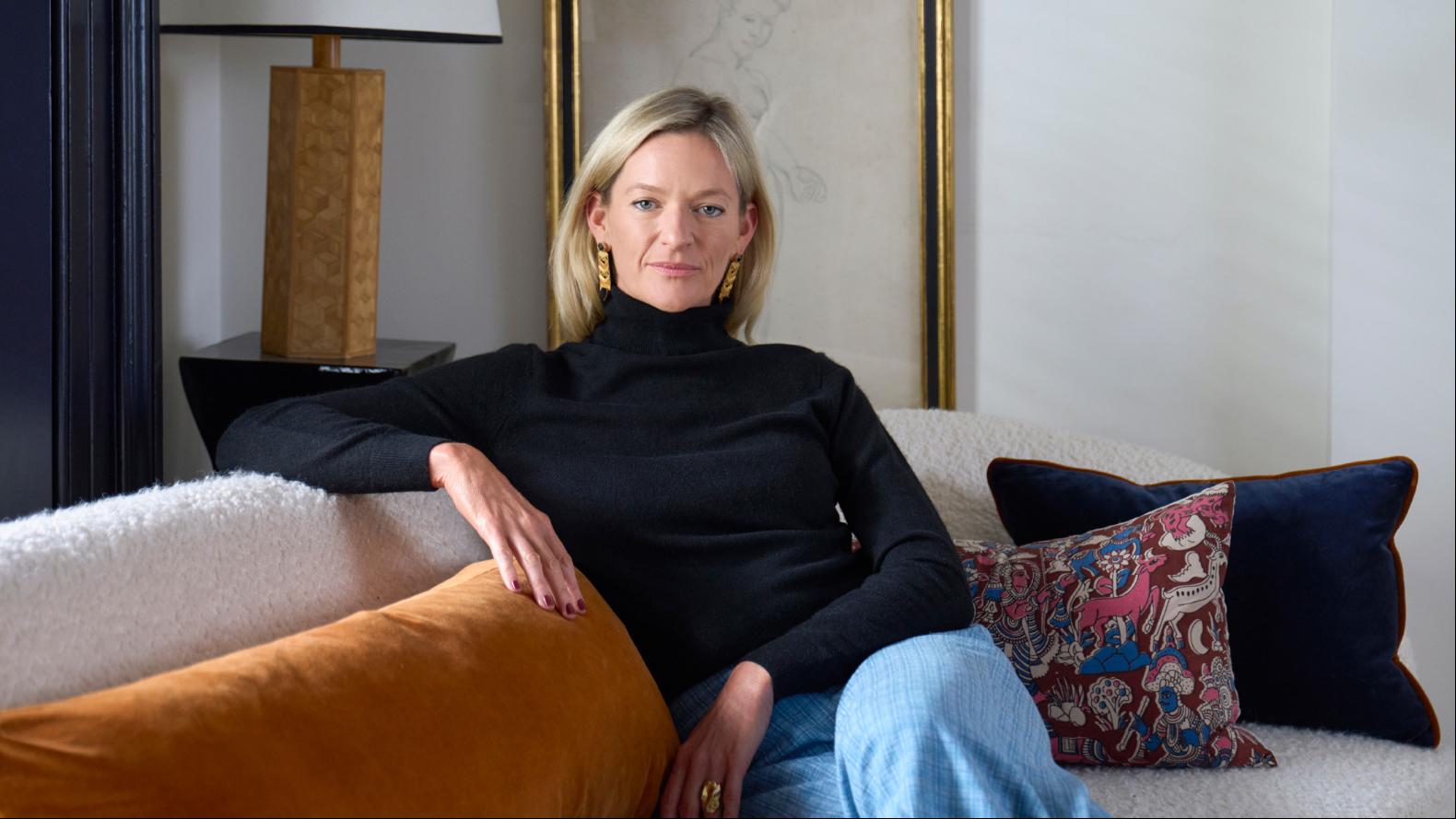
By Venetia Rudebeck
At Studio Vero, my partner, Romanos Brihi, and I share a deep appreciation for colour and pattern. We design spaces with character, often shaped by a striking palette. A kitchen is always a joy to design — it’s the beating heart of a home, where we spend time unwinding as well as cooking. It is far more than just a functional space, and should reflect the personality of its owners, making it a place to gather and relax.
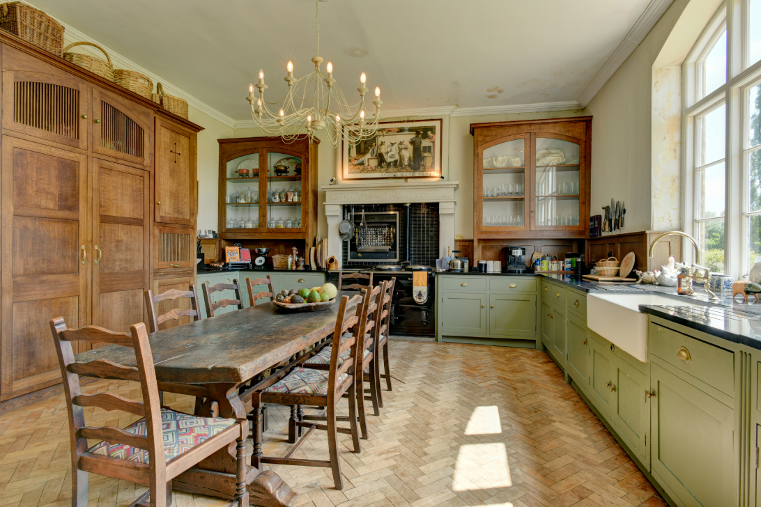
The traditional kitchen in this 19th-century manor house in west Dorset has great potential: classic Shaker-style cupboards, parquet flooring, and abundant natural light. Here’s how we would enhance the design to introduce more colour and pattern.
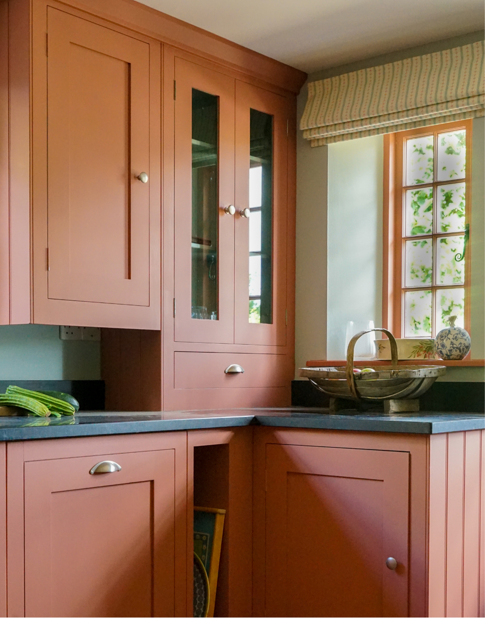
Colourful cabinetry
Given the stunning views and abundance of greenery outside, we would contrast the kitchen cabinets by painting them in Sang de Boeuf by Edward Bulmer. This terracotta shade is both calming and warm, yet bold enough to make a statement. It also pairs well with the black granite worktop and brass hardware.
Original art
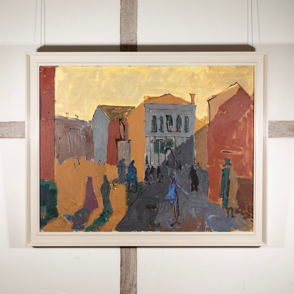
Romanos and I share a passion for art and design. We thrive on sourcing and curating exceptional works of art that enhance the character and atmosphere of our clients’ spaces. For this kitchen, we might consider replacing the painting above the Aga with a piece by modern British painter Earl Haig. His signed oil painting, “Campo Santo Stefano, Venice”, available at the Jenna Burlingham Gallery, complements the rich, earthy palette of the space.
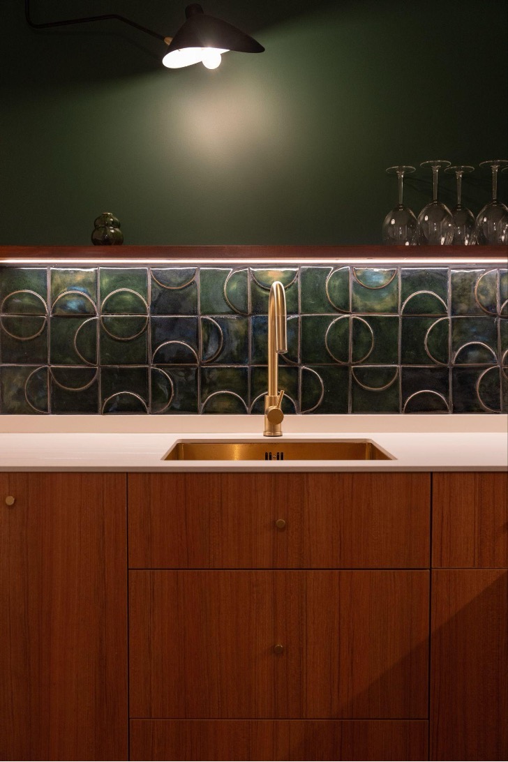
Rotating the tiles
An easy way to introduce pattern is by using tiles. Here, we’d love to create a splashback behind the Aga with handmade Penang relief ceramic tiles from Two and A Half Dimensions. Crafted in Naples using traditional techniques, these tiles feature a subtle yet distinctive pattern. By rotating the tiles during installation, we could add a playful and dynamic element to the design.
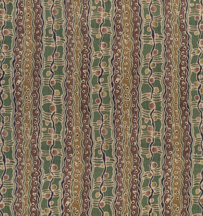
Window treatment
To create a cosy ambience and soften the space, we recommend adding a Roman blind. Not only does it add vibrancy, but it’s also practical — enhancing acoustics and creating warmth. For this window, we would choose Robert Kime’s linen mix fabric Russell. Inspired by an original 19th-century block print design, this fabric ties in with the property’s heritage while celebrating our love of print. Given the window’s size, the blind would serve as a striking focal point, almost like a piece of art.
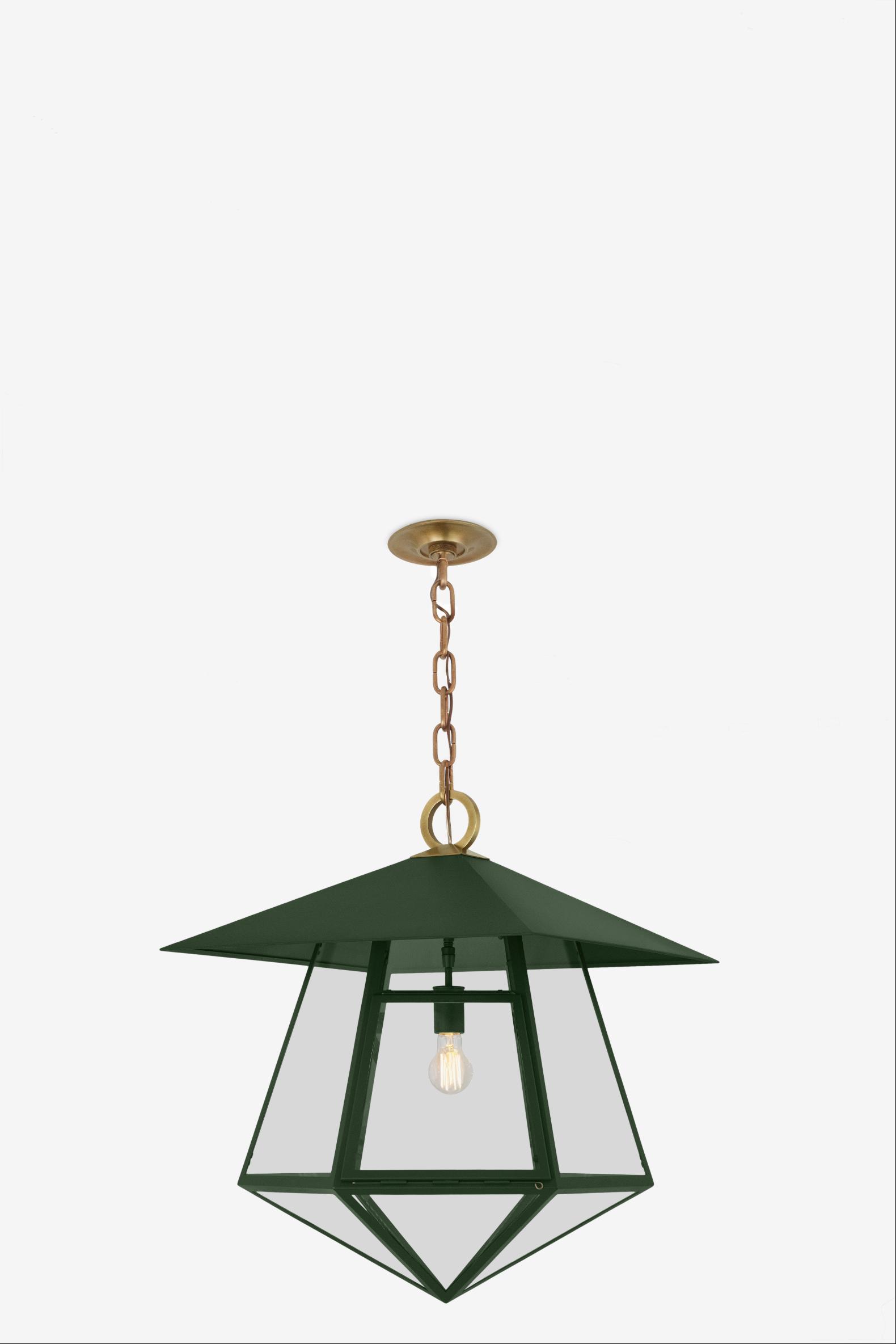
Bold lighting
For statement lighting, we adore The Urban Electric Company. Here, we would hang a pair of its Thaddeus pendant lights above the dining table. Their geometric forms and brass accents would add a modern touch to the space.
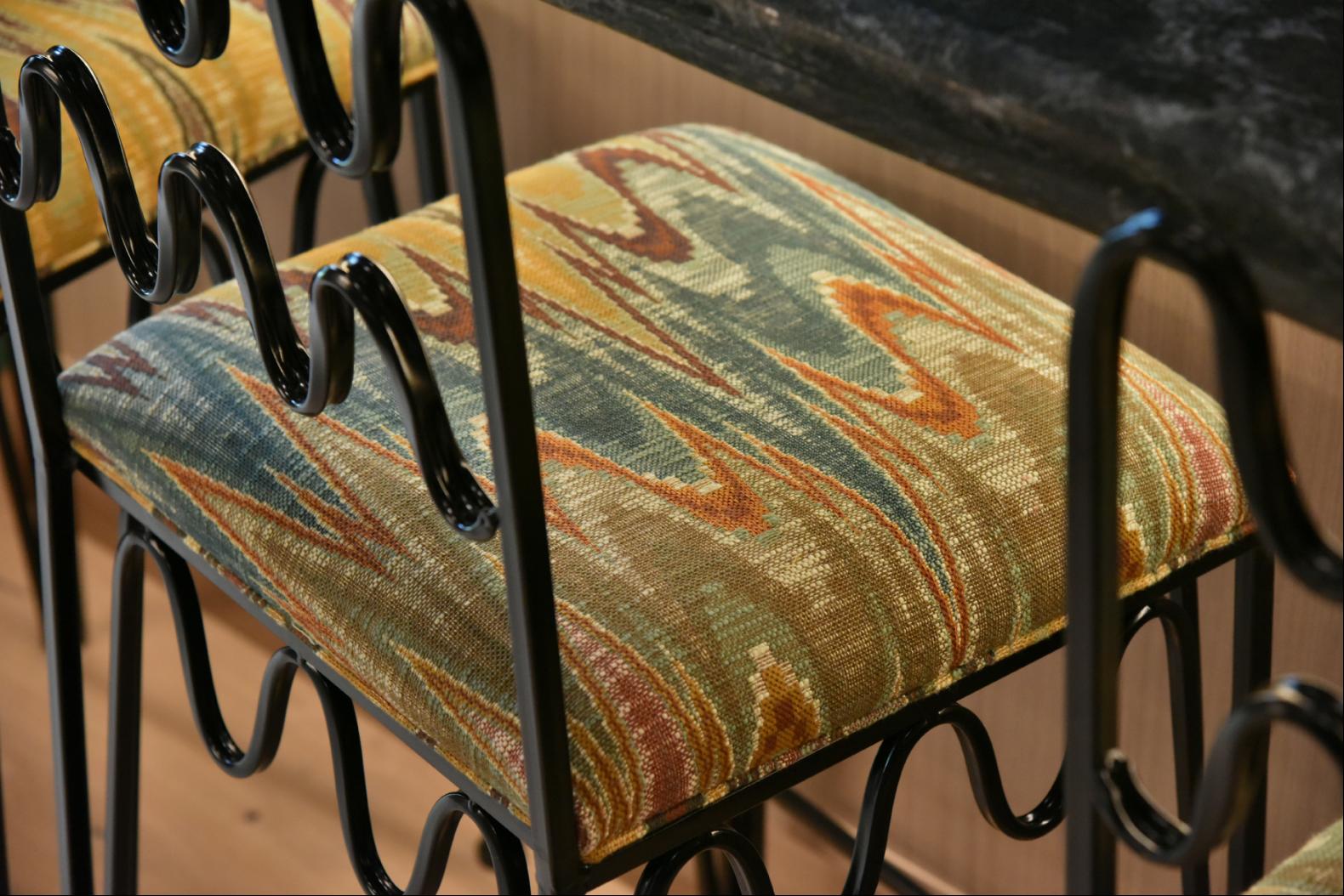
Reupholster the seating
A key consideration in any kitchen is to ensure a comfortable place to sit and eat. Where possible, we aim to reuse existing furniture. We love the style of the classic ladder-back dining chairs, but we would suggest reupholstering the seat cushions in Backgammon fabric by George Spencer. With only a small amount of fabric required, the zigzag pattern adds a decorative yet impactful touch.
Venetia Rudebeck is co-founder of Studio Vero
Photography: Knight Frank